Introduction
This blog post has description and examples of using the function MosaicPlot of the Mathematica package MosaicPlot.m provided by the project MathematicaForPrediction at GitHub. (Also see the document “Mosaic plots for data visualization” hosted at MathematicaForPrediction at GitHub. The document also has Mathematica code examples of usage and description of MosaicPlot‘s options.)
The function MosaicPlot summarizes the conditional probabilities of co-occurrence of the categorical values in a list of records of the same length. The list of records is assumed to be a full array and the columns to represent categorical values. (Note, that if a column is numerical but has a small number of different values it can be seen as categorical.)
I have read the descriptions of mosaic plots in the book “R in Action” by Robert Kabakoff and one of the references provided in the book (“What is a mosaic plot?” by Steve Simon). I was impressed how informative mosaic plots are and I figured they can be relatively easily implemented using Prefix trees (also known as “Tries”). I implemented MosaicPlot while working on a document analyzing the census income data from 1998, [6]. This is the reason that data set is used in this blog post. A good alternative set provided by ExampleData is {“Statistics”,”USCars1993″}.
Data set
The data set can be found and taken from http://archive.ics.uci.edu/ml/datasets/Census+Income.
The description of the data set is given in the file “adult.names” of the data folder. The data folder provides two sets with the same type of data “adult.data” and “adult.test”; the former is used for training, the latter for testing.
The total number of records in the file “adult.data” is 32561; the total number of records in the file “adult.test” is 16281.
Here is how the data looks like:

Since I did not understand the meaning of the column “fnlwgt” I dropped it from the data.
Here is the summary table of the data:
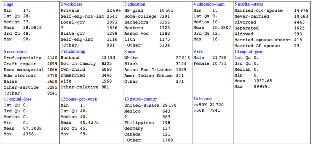
On the summary table the numerical variables are described with min, max, and quartiles. The category variables are described with the tallies of their values. The tallies of values are ordered in decreasing order. The tallies of truncated values are summed under the value “(Other)”.
Note that:
— only 24% of the labels are “>50K”;
— 2/3 of the records are for males;
— “capital-gain” and “capital-loss” are very skewed.
Mosaic plot explanations
If we pick a categorical variable, say “sex”, we can visualize the frequencies of the appearance of the variable values with the following plot:
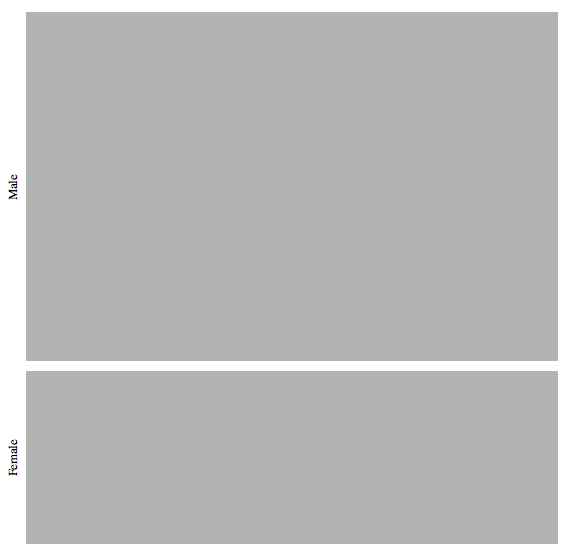
The size of the rectangles depends on the frequencies of appearance of the values “Male” and “Female” in the data records. From the rectangle sizes we can see what we already knew from the data summary table: approximately 2/3 of the records are about males.
We can subdivide every rectangle r according to the frequencies of co-occurrence of r’s value with the values of a second categorical variable, say “relationship”:

The labels corresponding to the values of “relationship” are rotated for legibility. The “relationship” labels are placed according to the co-occurrence with the value “Male” of the variable “sex”. The correspondent fractions of the pairs (“Female”,”Husband”), (“Female”,”Not-in-family”), etc., are deduced from order of the “relationship” labels.
Using colored mosaic plots can help distinguishing which rectangles correspond to which values. Here is the last plot with rectangles colored across the “relationship” data variable:
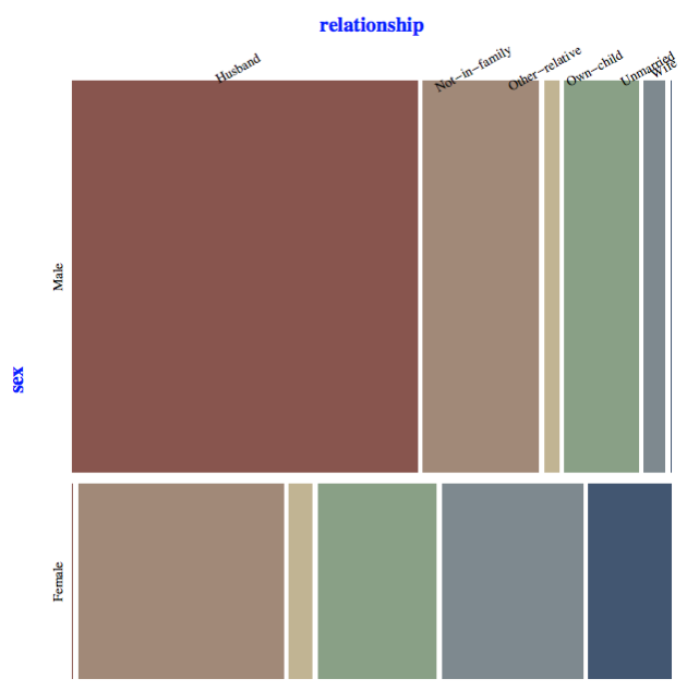
From the visual representations of the “sex vs. relationship” mosaic plot we can see that large fraction of the males are husbands, none (or a very small fraction) of them are wives. We can also see that none (or a very small fraction) of the females are husbands, the largest fraction of them are “Not-in-family”, and they are approximately three times more than the females that are wives.
Let us make another mosaic plot of a different kind of relationship “sex vs. education”:
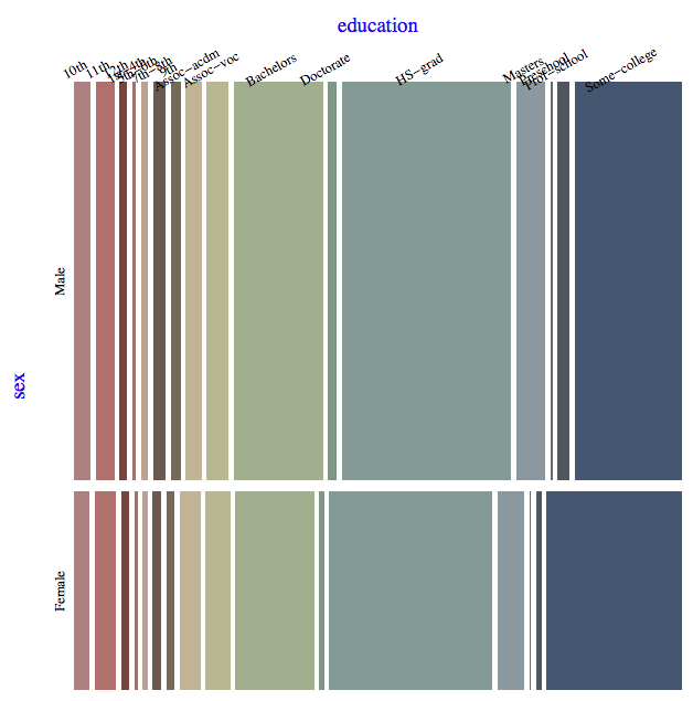
By comparing the sizes of the rectangles corresponding to the values “Bachelors”, “Doctorate”, “Masters”, and “Some-college” on the “sex vs. education” mosaic plot we can see that the fraction of men that have finished college is larger than the fraction of women that have finished college.
We can further subdivide the rectangles according to the co-occurrence frequencies with a third categorical variable. We are going to choose that third variable to be “income”, the values of which can be seen as outcomes or consequents of the values of the first two variables of the mosaic plot.
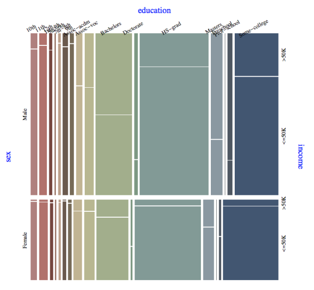
From the mosaic plot “sex vs. education vs. income” we can make the following observations.
1. Approximately 75% of the males with doctorate degrees or with a professional school degree earn more than $50000 per year.
2. Approximately 60% of the females with a doctorate degree earn more than $50000 per year.
3. Approximately 45% of the females with a professional school degree earn more than $50000.
4. Across all education type females are (much) less likely to earn more than $50000 per year.
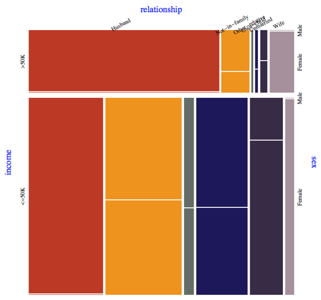
Although I mentioned earlier that the “outcome” variable should be the last variable in the mosaic plot, it is also useful to start with the outcome variable to get an attribute breakdown perspective (using a different color scheme):
Signature of MosaicPlot
MosaicPlot takes various options for tweaking the labels placement and style. Here is the Mathematica command:
MosaicPlot[censusData[[All, {9, 3, 5, 14}]], "Gap" -> 0.014,

 "ColumnNamesOffset" -> 0.07,

 "ColumnNames" ->

  Map[Style[#, Blue, FontSize -> 15] &, columnNames[[{9, 3, 5, 14}]]],

  "LabelRotation" -> {{3, 1}, {1, 1}}, ImageSize -> 900]
with which the following mosaic plot was made:
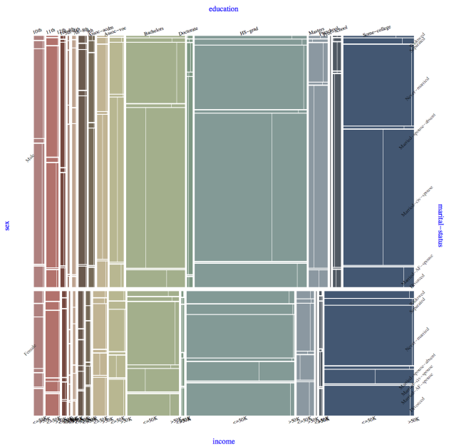
The option “Gap” used to regulate the gaps between the rectangle. The options “ColumnNames” and “ColumnNamesOffset” are for the specification of the variable names (in blue in the plot). The option “LabelRotation” specifies the rotation of the labels that correspond to the individual values of the variables. Also, MosaicPlot takes all the options of Graphics (since it is based on it).
Tooltip tables
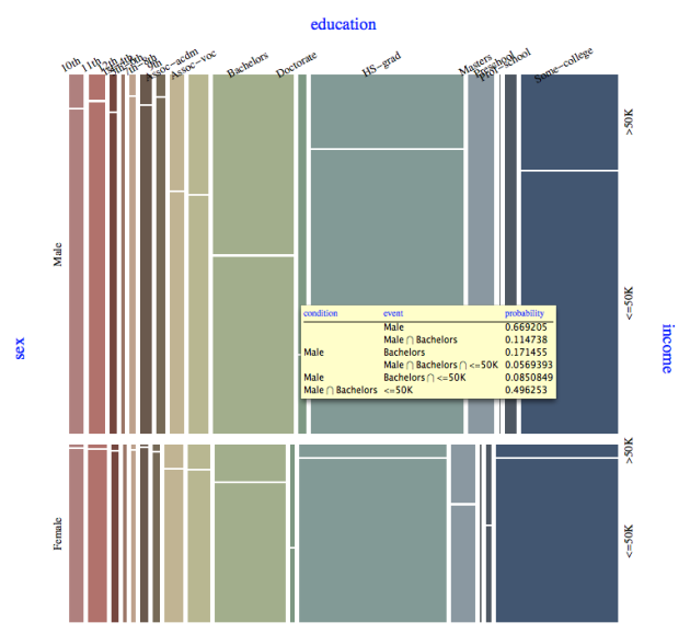
The function MosaicPlot has an interactive feature using Tooltip that gives a table with the exact co-occurrence (contingency) values when hovering with the mouse over the rectangles. Here is an example:
Future plans
The current implementation of MosaicPlot uses coloring of the rectangles for easier plot reading. An alternative is to use coloring based on correlations statistics. I think though that the tooltip contingency tables with flexible coloring specification make the correlation coloring less needed.
Pingback: Enhancements of MosaicPlot | Mathematica for prediction algorithms
Pingback: Classification and association rules for census income data | Mathematica for prediction algorithms
Pingback: Classification and association rules for census income data | Mathematica for prediction algorithms
Pingback: Contingency tables creation examples | Mathematica for prediction algorithms
Pingback: Text analysis of Trump tweets | Mathematica for prediction algorithms
Pingback: Trie based classifiers evaluation | Mathematica for prediction algorithms