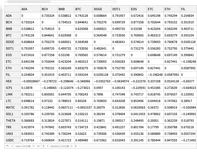
Extracting Russian casualties in Ukraine data from Mediazona publications

Introduction

In this blog post (corresponding to this notebook) we discuss data extraction techniques from the Web site Mediazona that tracks the Russian casualties in Ukraine. See [MZ1].

Since we did not find a public source code (or data) repository (like GitHub) of the data, we extract the data directly from the web site [MZ1]. We can use both (i) image processing and (ii) web browser automation. But since we consider the latter to be both time consuming and unreliable to reproduce, in this notebook we consider only image processing (combined with AI vision.)

We did not “harvest” all types of data from Mediazona, only the casualties per week and day for all troops. (Which we see as most important.)

This notebook is intentionally kept to be only “technical know-how”, without further data analysis, or correlation confirmations with other publications, or model applications, etc. We plan to do analysis and modeling in other notebooks/articles. (Using data from Mediazona and other sources.)

Remark: At the time of programming the extractions of this notebook, (2023-11-29), Midiazona, [MZ1], says that the Russian casualties it presents are corroborated by publicly available data as of 17 November, 2023.

Remark: Mediazona is Anti Putinist, [Wk1], and (judging from its publications) it is pro-Ukraine and pro-West.

Similar other data sources

Here is a couple of other data sources with similar intent or mission:

Remark: Those are pro-Russian sites.

TL;DR

Here is the data that is extracted below using image processing and OpenAI’s LLM vision capabilities, [AAn1, OAIb1]:

Here is the corresponding JSON file.

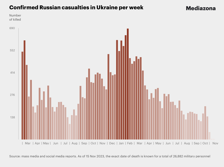
Here is a bar chart with tooltips for the weekly casualties that corresponds to the weekly casualties bar chart in [MZ1] (for all troops):

bcCol = RGBColor @@ ({143, 53, 33}/255);
xTicks = MapIndexed[{#2[[1]], DateString[First@#WeekSpan, {"MonthNameShort", " '", "YearShort"}]} &, mediaZonaData];
BarChart[Map[Tooltip[#["total_casualties"], Labeled[Grid[Map[{#[[1]], " : ", #[[2]]} &, List @@@ Normal[#["count_per_day"]]]], Column[{Style[#["week_span"], Blue], Row[{"total casualties:", Spacer[3], Style[#["total_casualties"], Red]}]}], Top]] &, mediaZonaData 
  ], 
  PlotTheme -> "Detailed", 
  FrameLabel -> Map[Style[#, FontSize -> 14] &, {"Week", "Number of killed"}], FrameTicks -> {{Automatic, Automatic}, {{#[[1]], Rotate[#[[2]], \[Pi]/6]} & /@ xTicks[[1 ;; -1 ;; 4]], Automatic}}, PlotLabel -> Style["Confirmed Russian casualties in Ukraine per week", Bold, FontSize -> 18], 
  ChartStyle -> Block[{tcs = Map[#["total_casualties"] &, mediaZonaData]}, Blend[{White, bcCol}, #] & /@ (tcs/Max[tcs])], 
  ImageSize -> 1000, 
  AspectRatio -> 1/1.8 
 ]

Document structure

The rest of document has the following sections:

  • Images with data
  • Weekly casualties extraction
  • Daily data extraction from daily bar chart
  • Daily data extraction from weekly bar chart tooltips
  • Additional comments and remarks

The second and fourth sections have subsections that outline the corresponding procedures.

Images with data

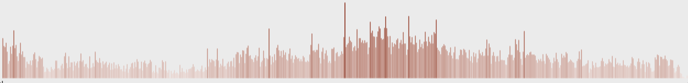
At first we got two images from [MZ1]: one for casualties per week and one for casualties per day. (For all troops.)

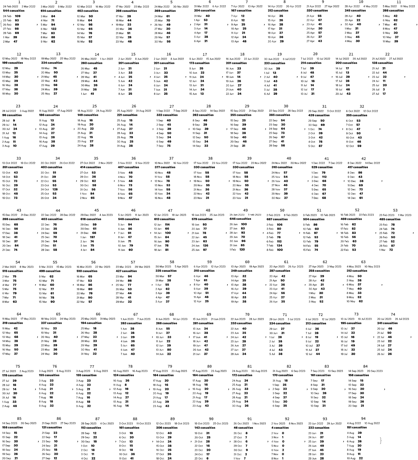
Then in order to extract more faithful daily casualties data we took ≈90 screenshots of the weekly casualties bar chart at [MZ1], each screenshot with a tooltip shown for a different week.

Casualties per week

Casualties per day

Screenshots of weekly bar chart with tooltips

In order to get more faithful data readings of the daily casualties multiple (≈90) screenshots were taken of the weekly casualties bar chart, each of the screenshots having a tooltip table of one (unique) bar. It took ≈15 minutes to take those screenshots. They can be obtained from this Google Drive link.

Here is how one of them looks like:

Number of days and number weeks

Here is the number of weeks we expect to see in the “Casualties per week” plot:

nWeeks = Round@DateDifference[DateObject[{2022, 02, 24}], DateObject[{2023, 11, 17}], "Week"]

(* 90 wk *)

Here is the number of days we expect to see in the “Casualties per day” plot:

nDays = Round@DateDifference[DateObject[{2022, 02, 24}], DateObject[{2023, 11, 03}]]

(*617 days*)

Weekly data extraction

Procedure

Here is the outline of the procedure:

  • Crop the image, so only the bar chart elements are on it
  • Binarize the image, and negated
    • So all visible bars are white on black background
  • Extracting morphological components
  • Find the bar sizes from the extracted components
  • Rescale to match real data
  • Check the absolute and relative errors between derived total number of casualties and the published one

Crop image

Here we take “the bars only” part of the image:

imgCasualtiesPerWeek2 = ImageTake[imgCasualtiesPerWeek, {120, -140}, {100, -60}]

Binarization and color negation

Binarize the cropped the image:

img = Binarize[imgCasualtiesPerWeek2, 0.85]

Here we binarize and color negate the image:

img2 = ColorNegate@Binarize[img]

Extracting morphological components

Here is the result of an application of morphological components finder:

MorphologicalComponents[img2] // Colorize

Find the bounding boxes of the morphological components:

aBoxes = SortBy[Association[ComponentMeasurements[img2, "BoundingBox"]], #[[1, 1]] &];
aBoxes = AssociationThread[Range@Length@aBoxes, Values@aBoxes];
aBoxes[[1 ;; 4]]

(*<|1 -> {{14., 6.}, {24., 473.}}, 2 -> {{25., 6.}, {35., 533.}}, 3 -> {{37., 6.}, {47., 402.}}, 4 -> {{48., 6.}, {58., 235.}}|>*)

Here we see are all component bounding boxes having the same minimum y-coordinate:

Tally@Values[aBoxes][[All, 1, 2]]

(*{{6., 66}, {7., 22}}*)

Find the heights of the rectangles and make a corresponding bar plot:

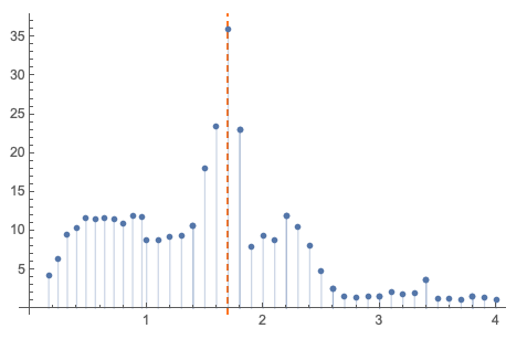
(*aHeights=Map[#\[LeftDoubleBracket]2,2\[RightDoubleBracket]-#\[LeftDoubleBracket]1,2\[RightDoubleBracket]&,aBoxes];*)
  aHeights = Map[#[[2, 2]] - Min[Values[aBoxes][[All, 1, 2]]] &, aBoxes]; 
   BarChart[aHeights, PlotTheme -> "Detailed", ImageSize -> 900]

Rescaling to match real data

The extracted data has to be rescaled to match the reported data. (We can see we have to “calibrate” the extracted data over a few points of the real data.)

Here we remake the plot above to include characteristic points we can use the calibration:

pos = Position[aHeights, Max[aHeights]][[1, 1, 1]];
pos2 = 23;
aHeights2 = aHeights;
Do[aHeights2[p] = Callout[aHeights2[[p]]], {p, {1, pos2, pos}}];
BarChart[aHeights2, GridLines -> {pos, None}, PlotTheme -> "Detailed",ImageSize -> 900]

Here are a few characteristic points of the real data

aRealHeights = <|1 -> 544, 7 -> 167, 23 -> 96, pos2 -> 414, pos -> 687|>

(*<|1 -> 544, 7 -> 167, 23 -> 414, 50 -> 687|>*)

Rescaling formula:

frm = Rescale[x, {aHeights[pos2], aHeights[pos]}, {aRealHeights[pos2], aRealHeights[pos]}]

(*369.219 + 0.539526 x*)
frm = Rescale[x, {0, aHeights[pos]}, {0, aRealHeights[pos]}]

(*0. + 1.16638 x*)

Rescaling function:

f = With[{fb = frm /. x -> Slot[1]}, fb &]

(*0. + 1.16638 #1 &*)

Apply the rescaling function:

aHeightsRescaled = Ceiling@*f /@ aHeights

(*<|1 -> 545, 2 -> 615, 3 -> 462, 4 -> 268, 5 -> 370, 6 -> 205, 7 -> 168, 8 -> 213, 9 -> 321, 10 -> 247, 11 -> 299, 12 -> 200, 13 -> 335, 14 -> 261, 15 -> 202, 16 -> 174, 17 -> 202, 18 -> 233, 19 -> 234, 20 -> 215, 21 -> 201, 22 -> 139, 23 -> 97, 24 -> 152, 25 -> 187, 26 -> 150, 27 -> 222, 28 -> 333, 29 -> 263, 30 -> 256, 31 -> 385, 32 -> 440, 33 -> 356, 34 -> 352, 35 -> 404, 36 -> 415, 37 -> 408, 38 -> 378, 39 -> 331, 40 -> 311, 41 -> 530, 42 -> 418, 43 -> 399, 44 -> 404, 45 -> 616, 46 -> 549, 47 -> 614, 48 -> 580, 49 -> 647, 50 -> 687, 51 -> 504, 52 -> 469, 53 -> 486, 54 -> 516, 55 -> 500, 56 -> 511, 57 -> 427, 58 -> 336, 59 -> 311, 60 -> 250, 61 -> 289, 62 -> 259, 63 -> 313, 64 -> 320, 65 -> 238, 66 -> 195, 67 -> 284, 68 -> 269, 69 -> 282, 70 -> 234, 71 -> 235, 72 -> 214, 73 -> 196, 74 -> 242, 75 -> 179, 76 -> 156, 77 -> 125, 78 -> 165, 79 -> 173, 80 -> 171, 81 -> 163, 82 -> 159, 83 -> 122, 84 -> 114, 85 -> 163, 86 -> 207, 87 -> 144, 88 -> 47|>*)

Here are some easy to check points (post-rescaling):

KeyTake[aHeightsRescaled, {1, 2, 7, Length[aHeightsRescaled]}]

(*<|1 -> 545, 2 -> 615, 7 -> 168, 88 -> 47|>*)

Verification check

Here is the image-extraction, estimated total:

imgTotal = aHeightsRescaled // Total

(*26961*)

The estimated total is close to the reported $26882$, with $79$absolute error and$\approx 3$‰ relative error:

reportTotal = 26882;
errAbs = N@Abs[reportTotal - imgTotal]
errRatio = N@Abs[reportTotal - imgTotal]/reportTotal

(*79.*)

(*0.00293877*)

Remark: The reported total number of casualties can be seen in the original weekly casualties screenshot above.

Daily data extraction from daily bar chart

Daily casualties extraction is not that easy with technique applied to the weekly casualties plot. One of the reasons is that the daily casualties plot is also a user input interface(on that web page).

Since we want to get daily data for calibration of (generalized) Lanchester law models we can simply extrapolate the weekly data with daily averages. We can also over-impose in some way the two images (or plots) in order to convince ourselves that we have a faithful enough interpolation.

lsDailyHeightsRescaled = Flatten@Map[Table[#, 7]/7 &, Values[aHeightsRescaled]];
BarChart[lsDailyHeightsRescaled, ImageSize -> 900, AspectRatio -> 1/8,PlotTheme -> "Web"]

Nevertheless, more faithful daily data can be obtained by image- and LLM processing the tooltips of the weekly casualties chart. (See the next section.)


Daily data extraction from weekly bar chart tooltips

Procedure

Here is the procedure outline:

  • Take multiple screenshots of the weekly casualties bar chart
    • A screenshot for each week with the corresponding tooltip shown
    • Make sure all screenshots have the same size (or nearly the same size)
      • E.g. take “window screenshots”
    • ≈90 screenshots can be taken within 15 minutes
  • Crop the screenshots appropriately
  • In order to get the tooltip tables only for each screenshot:
  • Verify good tooltips table image is obtained for each screenshot (week)
  • Do Optical Character Recognition (OCR) over the images
    • One option is to send them to an Artificial Intelligence (AI) vision service
    • Another option is to use WL’s TextRecognize
  • Parse or otherwise process the obtained OCR (or AI vision) results
  • Verify that each week is reflected in the data
    • It might happen that screenshots are not “a full set“
  • Make time series with the obtained data and compare or verify with published data and plots
    • Check are the casualties totals the same, do the plots look similar, etc.
  • Make an informative bar chart with tooltips
    • That resembles the one the screenshots were taken from
    • See the subsection “TL;DR” in the introduction

Remark: When using AI vision the prompt engineering might take a few iterations, but not that many.

Remark: The few experiments with the WL built-in text recognition produced worse results than using AI vision. Hence, they were not extended further.

Screenshots ingestion

Get screenshot file names

dirNameImport = FileNameJoin[{NotebookDirectory[], "Screenshots-Mediazona-weekly-casualties-histogram"}];
lsFileNames = FileNames["*.png", dirNameImport];
Length[lsFileNames]

(*94*)

Import images

AbsoluteTiming[
  lsImgs = Import /@ lsFileNames; 
 ]

(*{2.50844, Null}*)

Here is one of the imported images:

ImageResize[lsImgs[[14]], 900]

Definition

Here define a function that is used to batch transform the screenshots:

Clear[MakeEasyToRead];
Options[MakeEasyToRead] = {"BoundingBox" -> Automatic, "BinarizingLimits" -> Automatic};
MakeEasyToRead[img_?ImageQ, opts : OptionsPattern[]] := 
   Block[{boundingBox, mbLimits, img2, img3}, 
    
    boundingBox = OptionValue[MakeEasyToRead, "BoundingBox"]; 
    If[TrueQ[boundingBox === Automatic], boundingBox = {{380, -180}, {280, -280}}]; 
    
    mbLimits = OptionValue[MakeEasyToRead, "BinarizingLimits"]; 
    If[TrueQ[mbLimits === Automatic], mbLimits = {0.2, 0.75}]; 
    
    img2 = ImageTake[img, Sequence @@ boundingBox]; 
    img3 = MorphologicalBinarize[ColorNegate@img2, mbLimits]; 
    ImageCrop[ColorNegate[img3]] 
   ];

Remark: This function corresponds to the second and third step of the procedure outlined above.

Batch transform

AbsoluteTiming[
  lsImgTables = MakeEasyToRead[#, "BoundingBox" -> {{380, -100}, {280, -280}}, "BinarizingLimits" -> {0.4, 0.76}] & /@ lsImgs; 
 ]

(*{9.76089, Null}*)
MapIndexed[Labeled[#, #2[[1]], Top] &, lsImgTables]

Batch AI-vision application

Load the package “LLMVision.m”, [AAp1, AAn1]:

Import["https://raw.githubusercontent.com/antononcube/MathematicaForPrediction/master/Misc/LLMVision.m"]

Here we do batch AI vision application, [AAn1], using an appropriate prompt:

h = 11;
AbsoluteTiming[
  lsImgTableJSONs = 
    Table[(
      Echo[Style[{i, i + (h - 1)}, Purple, Bold], "Span:"]; 
      t = 
       LLMVisionSynthesize[{
         "Get the 1) week span, 2) total casualties 3) count per day from the image.\n", 
         "Give the result as a JSON record with keys 'week_span', 'total_casualties', and 'count_per_day'.\n", 
         "Here is example of the JSON record for each image:{\"week_span\": \"10 Mar 2022 - 16 Mar 2022\",\"total_casualties\": 462,\"count_per_day\": {\"10 Mar\": 50,\"11 Mar\": 64,\"12 Mar\": 98,\"13 Mar\": 65,\"14 Mar\": 76,\"15 Mar\": 57,\"16 Mar\": 52}}", 
         LLMPrompt["NothingElse"]["JSON"] 
        }, 
        Take[lsImgTables, {i, UpTo[i + (h - 1)]}], 
        "MaxTokens" -> 1200, "Temperature" -> 0.1]; 
      Echo[t, "OCR:"]; 
      t 
     ), 
     {i, 1, Length[lsImgs], h}]; 
 ]
(*{260.739, Null}*)

Process AI-vision results

Extract JSONs and import them as WL structures:

pres1 = Map[ImportString[StringReplace[#, {"```json" -> "", "```" -> ""}], "RawJSON"] &, lsImgTableJSONs];
pres1[[1 ;; 2]]

(*{{<|"week_span" -> "24 Feb 2022 - 2 Mar 2022", "total_casualties" -> 544, "count_per_day" -> <|"24 Feb" -> 109, "25 Feb" -> 93, "26 Feb" -> 89, "27 Feb" -> 98, "28 Feb" -> 69, "1 Mar" -> 39, "2 Mar" -> 47|>|>, <|"week_span" -> "3 Mar 2022 - 9 Mar 2022", "total_casualties" -> 614, "count_per_day" -> <|"3 Mar" -> 84, "4 Mar" -> 71, "5 Mar" -> 94, "6 Mar" -> 132, "7 Mar" -> 83, "8 Mar" -> 88, "9 Mar" -> 62|>|>, <|"week_span" -> "10 Mar 2022 - 16 Mar 2022", "total_casualties" -> 462, "count_per_day" -> <|"10 Mar" -> 50, "11 Mar" -> 64, "12 Mar" -> 98, "13 Mar" -> 65, "14 Mar" -> 76, "15 Mar" -> 57, "16 Mar" -> 52|>|>, <|"week_span" -> "17 Mar 2022 - 23 Mar 2022","total_casualties" -> 266, "count_per_day" -> <|"17 Mar" -> 28, "18 Mar" -> 44, "19 Mar" -> 33, "20 Mar" -> 36, "21 Mar" -> 51, "22 Mar" -> 28, "23 Mar" -> 46|>|>, <|"week_span" -> "24 Mar 2022 - 30 Mar 2022","total_casualties" -> 369, "count_per_day" -> <|"24 Mar" -> 61, "25 Mar" -> 70, "26 Mar" -> 49, "27 Mar" -> 30, "28 Mar" -> 46, "29 Mar" -> 57, "30 Mar" -> 56|>|>, <|"week_span" -> "31 Mar 2022 - 6 Apr 2022", "total_casualties" -> 204, "count_per_day" -> <|"31 Mar" -> 40, "1 Apr" -> 53, "2 Apr" -> 31, "3 Apr" -> 14, "4 Apr" -> 17, "5 Apr" -> 28, "6 Apr" -> 21|>|>, <|"week_span" -> "7 Apr 2022 - 13 Apr 2022", "total_casualties" -> 167, "count_per_day" -> <|"7 Apr" -> 12, "8 Apr" -> 12, "9 Apr" -> 25, "10 Apr" -> 25, "11 Apr" -> 21, "12 Apr" -> 24, "13 Apr" -> 48|>|>, <|"week_span" -> "14 Apr 2022 - 20 Apr 2022","total_casualties" -> 212, "count_per_day" -> <|"14 Apr" -> 35, "15 Apr" -> 26, "16 Apr" -> 28, "17 Apr" -> 21, "18 Apr" -> 37, "19 Apr" -> 36, "20 Apr" -> 29|>|>, <|"week_span" -> "21 Apr 2022 - 27 Apr 2022","total_casualties" -> 320, "count_per_day" -> <|"21 Apr" -> 55, "22 Apr" -> 67, "23 Apr" -> 41, "24 Apr" -> 30, "25 Apr" -> 57, "26 Apr" -> 27, "27 Apr" -> 43|>|>, <|"week_span" -> "28 Apr 2022 - 4 May 2022", "total_casualties" -> 245, "count_per_day" -> <|"28 Apr" -> 40, "29 Apr" -> 22, "30 Apr" -> 40, "1 May" -> 31, "2 May" -> 37, "3 May" -> 45, "4 May" -> 30|>|>, <|"week_span" -> "5 May 2022 - 11 May 2022", "total_casualties" -> 298, "count_per_day" -> <|"5 May" -> 42, "6 May" -> 62, "7 May" -> 41, "8 May" -> 47, "9 May" -> 30, "10 May" -> 37, "11 May" -> 39|>|>}, {<|"week_span" -> "12 May 2022 - 18 May 2022", "total_casualties" -> 199, "count_per_day" -> <|"12 May" -> 29, "13 May" -> 25, "14 May" -> 30, "15 May" -> 29, "16 May" -> 28, "17 May" -> 38, "18 May" -> 20|>|>, <|"week_span" -> "19 May 2022 - 25 May 2022","total_casualties" -> 334, "count_per_day" -> <|"19 May" -> 74, "20 May" -> 50, "21 May" -> 45, "22 May" -> 43, "23 May" -> 56, "24 May" -> 39, "25 May" -> 27|>|>, <|"week_span" -> "26 May 2022 - 1 Jun 2022", "total_casualties" -> 260, "count_per_day" -> <|"26 May" -> 45, "27 May" -> 37, "28 May" -> 41, "29 May" -> 44, "30 May" -> 26, "31 May" -> 26, "1 Jun" -> 41|>|>, <|"week_span" -> "2 Jun 2022 - 8 Jun 2022", "total_casualties" -> 201, "count_per_day" -> <|"2 Jun" -> 21, "3 Jun" -> 33, "4 Jun" -> 25, "5 Jun" -> 42, "6 Jun" -> 24, "7 Jun" -> 31, "8 Jun" -> 25|>|>, <|"week_span" -> "9 Jun 2022 - 15 Jun 2022", "total_casualties" -> 173, "count_per_day" -> <|"9 Jun" -> 35, "10 Jun" -> 22, "11 Jun" -> 24,"12 Jun" -> 24, "13 Jun" -> 21, "14 Jun" -> 34, "15 Jun" -> 13|>|>, <|"week_span" -> "16 Jun 2022 - 22 Jun 2022","total_casualties" -> 201, "count_per_day" -> <|"16 Jun" -> 23, "17 Jun" -> 37, "18 Jun" -> 14, "19 Jun" -> 26, "20 Jun" -> 27, "21 Jun" -> 40, "22 Jun" -> 34|>|>, <|"week_span" -> "30 Jun 2022 - 6 Jul 2022", "total_casualties" -> 233, "count_per_day" -> <|"30 Jun" -> 39, "1 Jul" -> 13, "2 Jul" -> 40, "3 Jul" -> 43, "4 Jul" -> 41, "5 Jul" -> 28, "6 Jul" -> 29|>|>, <|"week_span" -> "7 Jul 2022 - 13 Jul 2022", "total_casualties" -> 214, "count_per_day" -> <|"7 Jul" -> 39, "8 Jul" -> 48, "9 Jul" -> 47, "10 Jul" -> 18, "11 Jul" -> 14, "12 Jul" -> 17, "13 Jul" -> 31|>|>, <|"week_span" -> "14 Jul 2022 - 20 Jul 2022","total_casualties" -> 200, "count_per_day" -> <|"14 Jul" -> 17, "15 Jul" -> 13, "16 Jul" -> 29, "17 Jul" -> 28, "18 Jul" -> 24, "19 Jul" -> 46, "20 Jul" -> 43|>|>, <|"week_span" -> "21 Jul 2022 - 27 Jul 2022","total_casualties" -> 138, "count_per_day" -> <|"21 Jul" -> 21, "22 Jul" -> 44, "23 Jul" -> 22, "24 Jul" -> 11, "25 Jul" -> 20, "26 Jul" -> 3, "27 Jul" -> 17|>|>}}*)

Make a list of weekly records and make sure to have unique data records:

pres2 = Union[Flatten[pres1]];
Length[pres2]

(*89*)

To each record add a WL expression for the extracted week span and sort the records by week start date:

pres3 = Map[Prepend[#, "WeekSpan" -> Map[DateObject@*StringTrim, StringSplit[#["week_span"], "-"]]] &, pres2];
pres3 = SortBy[pres3, First@#WeekSpan &];

Here are the first two records:

pres3[[1 ;; 2]]

Verification (all weeks are present)

Summarize the starts of week:

ResourceFunction["RecordsSummary"][Map[First@#WeekSpan &, pres3]]

Make sure consistent weekly data is obtained:

Differences[Sort@Map[First@#WeekSpan &, pres3]] // Tally

Plots

Here is bar chart with tooltips based using the extracted data:

BarChart[Tooltip[#["total_casualties"], Labeled[Grid[Map[{#[[1]], " : ", #[[2]]} &, List @@@ Normal[#["count_per_day"]]]], Column[{Style[#["week_span"], Blue], Row[{"total casualties:", Spacer[3], Style[#["total_casualties"], Red]}]}], Top]] & /@ pres3, AxesLabel -> {"Week", "Number of\nkilled"}, ImageSize -> 700]

Remark: See the subsection “TL;DR” in the introduction for a better plot.

Here we make the corresponding daily casualties time series and plot it:

pres4 = Map[AssociationThread[DateRange @@ #WeekSpan, Values[#["count_per_day"]]] &, pres3];
pres5 = Join @@ pres4;
tsCasualties = TimeSeries[pres5];
DateListPlot[tsCasualties, PlotRange -> All, AspectRatio -> 1/6, FrameLabel -> {"Time", "Number of killed"}, ImageSize -> 1200]

Verification (with published results)

Here is the total number casualties based on the extracted data:

tooltipTotal = Total@tsCasualties

(*26879*)

It compares very well with the total number in the Mediazona’s plot — $3$ as an absolute error and$\approx 0.1$‰ relative error:

reportTotal = 26882;
errAbs = N@Abs[reportTotal - tooltipTotal]
errRatio = N@Abs[reportTotal - tooltipTotal]/reportTotal

(*3.*)

(*0.000111599*)

Additional comments and remarks

Good agreement between the two procedures

The two data extraction procedures agree very well over the extracted totals of casualties.

(Also good agreement with the “official” published total — approximately $3$‰ and $0.1$‰ respectively.)

LLMVision package

The function LLMVisionSynthesize used above is from the package “LLMVision.m”, [AAp1, AAn1]. One of the primary reasons to develop the package “LLMvision.m” was to use it in workflows like those above — extracting data from different sources in order to do war simulations.

Remark: In the section above LLMVisionSynthesize uses Base64 conversion of images. OpenAI’s Vision documentation advices to use URLs instead of Base64 images in long conversations.

Why apply image transformations when using AI vision?

One can ask:

Why do certain image transformations, or other image preprocessing, if we are using AI vision functionalities? 

Can’t we just apply the AI?!

There are multiple reasons for preprocessing the images that are on different conceptual and operational levels:

  • We want to be able to use the same workflow but with different OCR algorithms that are “smaller” and “less AI”
  • Images having only the information to be extracted produce more reliable results
    • This obvious when OCR functions are used (like TextRecognize)
    • Less prompt engineering would be needed with AI-vision (most likely)
  • It is much cheaper — both computationally and money-wise — to use some smaller images for processed conveniently

Remark: OpenAI’s vision documentation discusses the money costs, preferred image formats, and reliability — see this “Limitations” section.

JSON data

The extracted daily Mediazona data was exported to JSON with this command:

(*Export[FileNameJoin[{NotebookDirectory[],"mediaZonaData.json"}],Map[Normal,mediaZonaData]/.d_DateObject:>DateString[d,"ISODate"]]*)

References

Articles

[MZ1] Mediazona, Russian casualties in Ukraine, (2022-2023).

[OAIb1] OpenAI team, “New models and developer products announced at DevDay” , (2023), OpenAI/blog .

[Wk1] Wikipedia, “Mediazona”.

Functions

[WRIf1] Wolfram Research, Inc., MorphologicalBinarize, Wolfram Language function,(2010), (updated 2012).

[WRIf2] Wolfram Research, Inc, ImageCrop, Wolfram Language function,(2008), (updated 2021).

[WRIf3] Wolfram Research, Inc, TextRecognize, Wolfram Language function,(2010), (updated 2020).

Notebooks

[AAn1] Anton Antonov, “AI vision via Wolfram Language​​”, November 26, (2023), Wolfram Community, STAFF PICKS.

Packages, paclets

[AAp1] Anton Antonov, LLMVision.m, Mathematica package, (2023), GitHub/antononcube .

Cryptocurrencies data explorations

Introduction

The main goal of this notebook is to provide some basic views and insights into the landscape of cryptocurrencies. The “landscape” we consider consists of price action and trading volume time series for cryptocurrencies found in Yahoo Finance.

Here is the work plan followed in this notebook:

  1. Get cryptocurrency data
  2. Do basic data analysis over suitable date ranges
  3. Gather important cryptocurrency events
  4. Plot together cryptocurrency prices and trading volume time series together with the events
  5. Make observations and conjectures over the plots
  6. Find “global” correlations between the different cryptocurrencies
  7. Find clusters of cryptocurrencies based on time series correlations

Here are some details for the steps above:

  • The procedure of obtaining the cryptocurrencies data, point 1, is explained in detail in [AA1].
    • There is a dedicated resource object CrypocurrencyData that provides cryptocurrency data and related documentation.
  • The cryptocurrency events data, point 3, is taken from different news sites.
    • Links are provided in the corresponding dataset.
  • The points 6 and 7 follow similar explorations (and code) described in [AA2, AA3].
    • Those two articles deal with COVID-19 time series.

Remark: Note that in this notebook we do not discuss philosophical, macro-economic, and environmental issues with cryptocurrencies. We only discuss financial time series data.

Cryptocurrencies data

The cryptocurrencies data used in this notebook is obtained from found in Yahoo Finance . The procedure of obtaining the cryptocurrencies data is explained in detail in [AA1]. There is a dedicated resource object CrypocurrencyData that provides the cryptocurrency data and related documentation.

Here are all cryptocurrencies we have data for:

ResourceFunction["CryptocurrencyData"]["CryptocurrencyNames"]

(*<|"BTC" -> "Bitcoin", "ETH" -> "Ethereum", "USDT" -> "Tether", "BNB" -> "BinanceCoin", "ADA" -> "Cardano", "XRP" -> "XRP", "USDC" -> "Coin", "DOGE" -> "Dogecoin", "DOT1" -> "Polkadot", "HEX" -> "HEX", "UNI3" -> "Uniswap", "BCH" -> "BitcoinCash", "LTC" -> "Litecoin", "LINK" -> "Chainlink", "SOL1" -> "Solana", "MATIC" -> "MaticNetwork", "THETA" -> "THETA", "XLM" -> "Stellar", "VET" -> "VeChain", "ICP1" -> "InternetComputer", "ETC" -> "EthereumClassic", "TRX" -> "TRON", "FIL" -> "FilecoinFutures", "XMR" -> "Monero", "EOS" -> "EOS"|>*)

Remark: FinancialData is “aware” of 10 cryptocurrencies, but that is not documented (as far as I can tell) and only prices are provided. (For more details see the discussion in CrypocurrencyData.) Here are examples:

Row[DateListPlot[FinancialData[#, "Jan 1 2021"], ImageSize -> Medium, AspectRatio -> 1/4, PlotLabel -> #] & /@ {"BTC", "ETH"}]
02bue86eonuo0

Significant cryptocurrencies

In this section we analyze the summaries of cryptocurrencies data in order to derive a list of the most significant ones.

We choose the phrase “significant cryptocurrency” to mean “a cryptocurrency with high market capitalization, price, or trading volume.”

Together with the summaries we look into the Pareto principle adherence of the corresponding values.

Remark: The Pareto principle adherence should be interpreted carefully here – the cryptocurrencies are not mutually exclusive when in comes to money invested and trading volumes. Nevertheless, we can interpret the corresponding value ratios as indicators of “mind share” or “significance.”

By summaries

Here is a summary of the cryptocurrencies we consider (from Yahoo Finance) ordered by “Market Cap” (largest first):

dsCCSummary = ResourceFunction["CryptocurrencyData"][All, "Summary"]
0u3re74xw7086

Here is the summary of summary dataset above:

ResourceFunction["RecordsSummary"][dsCCSummary]
14gue3qibxrf7

Here is a Pareto principle adherence plot for the cryptocurrency market caps:

aMCaps = Normal[dsCCSummary[Association, StringSplit[#Symbol, "-"][[1]] -> #["Market Cap"] &]]; ResourceFunction["ParetoPrinciplePlot"][aMCaps, PlotRange -> All, PlotLabel -> "Pareto principle for cryptocurrency market caps"]
0xgj73uot9hb1

Here is the Pareto statistic for the top 12 cryptocurrencies:

Take[AssociationThread[Keys@aMCaps, Accumulate[Values@aMCaps]]/Total[aMCaps], 12]

(*<|"BTC" -> 0.521221, "ETH" -> 0.71188, "USDT" -> 0.765931, "BNB" -> 0.800902, "ADA" -> 0.833777, "XRP" -> 0.856467, "USDC" -> 0.878274, "DOGE" -> 0.899587, "DOT1" -> 0.9121, "HEX" -> 0.924055, "UNI3" -> 0.932218, "BCH" -> 0.939346|>*)

By price

Get the mean daily closing prices data for the last two weeks and show the corresponding data summary:

startDate = DatePlus[Now, -Quantity[2, "Weeks"]]; aMeans = ReverseSort[Association[# -> Mean[ResourceFunction["CryptocurrencyData"][#, "Close", startDate]["Values"]] & /@ ResourceFunction["CryptocurrencyData"]["Cryptocurrencies"]]];
ResourceFunction["RecordsSummary"][aMeans, Thread -> True]
1rpeb683tls42

Pareto principle adherence plot:

ResourceFunction["ParetoPrinciplePlot"][aMeans, PlotRange -> All, PlotLabel -> "Pareto principle for cryptocurrency closing prices"]
1a9fsea677xld

Here are the Pareto statistic values for the top 12 cryptocurrencies:

aCCTop = Take[AssociationThread[Keys@aMeans, Accumulate[Values@aMeans]]/Total[aMeans], 12]

(*<|"BTC" -> 0.902595, "ETH" -> 0.959915, "BCH" -> 0.974031, "BNB" -> 0.982414, "XMR" -> 0.988689, "LTC" -> 0.992604, "FIL" -> 0.99426, "ICP1" -> 0.995683, "ETC" -> 0.997004, "SOL1" -> 0.997906, "LINK" -> 0.998449, "UNI3" -> 0.998987|>*)

Plot the daily closing prices of top cryptocurrencies since January 2018:

DateListPlot[Log10 /@ Association[# -> ResourceFunction["CryptocurrencyData"][#, "Close", "Jan 1, 2018"] & /@ Keys[aCCTop]], PlotLabel -> "lg of crytocurrencies daily closing prices, USD", PlotTheme -> "Detailed", PlotRange -> All]
19tfy1oj2yrs7

By trading volume

Get the mean daily trading volumes data for the last two weeks and show the corresponding data summary:

startDate = DatePlus[Now, -Quantity[2, "Weeks"]]; aMeans = ReverseSort[Association[# -> Mean[ResourceFunction["CryptocurrencyData"][#, "Volume", startDate]["Values"]] & /@ ResourceFunction["CryptocurrencyData"]["Cryptocurrencies"]]];
ResourceFunction["RecordsSummary"][aMeans, Thread -> True]
1lnrdt94mofry

Pareto principle adherence plot:

ResourceFunction["ParetoPrinciplePlot"][aMeans, PlotRange -> {0, 1.1},PlotRange -> All, PlotLabel -> "Pareto principle for cryptocurrency trading volumes"]
0nvcws0qh5hum

Here are the Pareto statistic values for the top 12 cryptocurrencies:

aCCTop = N@Take[AssociationThread[Keys@aMeans, Accumulate[Values@aMeans]]/Total[aMeans], 12]

(*<|"USDT" -> 0.405697, "BTC" -> 0.657918, "ETH" -> 0.817959, "XRP" -> 0.836729, "ADA" -> 0.853317, "ETC" -> 0.868084, "LTC" -> 0.882358, "DOGE" -> 0.896621, "BNB" -> 0.910013, "USDC" -> 0.923379, "BCH" -> 0.933938, "DOT1" -> 0.944249|>*)

Plot the daily closing prices of top cryptocurrencies since January 2018:

DateListPlot[Log10 /@ Association[# -> ResourceFunction["CryptocurrencyData"][#, "Volume", "Jan 1, 2018"] & /@ Keys[aCCTop]], PlotLabel -> "lg of cryptocurrencies trading volumes", PlotTheme -> "Detailed", PlotRange -> {5, Automatic}]
1tns5zrq560q7

In this section we make a dataset that has the dates of certain cryptocurrency related events and links to their news announcements.

The events were taken by observing cryptocurrency board stories in the news aggregation site slashdot.org.

lsEventData = {
    {"Jun 18, 2021", "China to shut down over 90% of its Bitcoin mining capacity after local bans", "https://www.globaltimes.cn/page/202106/1226598.shtml"}, 
    {"Jun 10, 2021", "Global banking regulators call for toughest rules for cryptocurrencies", "https://www.theguardian.com/technology/2021/jun/10/global-banking-regulators-cryptocurrencies-bitcoin"}, 
    {"June 10, 2021", "IMF sees legal, economic issues with El Salvador's bitcoin move","https://www.reuters.com/business/finance/imf-sees-legal-economic-issues-with-el-salvador-bitcoin-move-2021-06-10/"}, 
    {"June 8, 2021", "El Salvador Becomes First Country To Adopt Bitcoin as Legal Tender After Passing Law", "https://www.cnbc.com/2021/06/09/el-salvador-proposes-law-to-make-bitcoin-legal-tender.html"}, 
    {"June 8, 2021", "US recovers millions in cryptocurrency paid to Colonial Pipeline ransomware hackers", "https://edition.cnn.com/2021/06/07/politics/colonial-pipeline-ransomware-recovered/"}, 
    {"June 4, 2021", "Start of Bitcoin 2021: World\[CloseCurlyQuote]s Largest Cryptocurrency Conference Coming To Wynwood", "https://miami.cbslocal.com/2021/06/04/bitcoin-2021-worlds-largest-cryptocurrency-conference-coming-to-wynwood/"}, 
    {"June 6, 2021", "End of Bitcoin 2021: World\[CloseCurlyQuote]s Largest Cryptocurrency Conference Coming To Wynwood", "https://miami.cbslocal.com/2021/06/04/bitcoin-2021-worlds-largest-cryptocurrency-conference-coming-to-wynwood/"}, 
    {"May 28, 2021", "Iran Bans Crypto Mining After Months of Blackouts", "https://gizmodo.com/iran-bans-crypto-mining-after-months-of-blackouts-1846991039"}, 
    {"May 19, 2021", "Bitcoin, Ethereum prices in free fall as China plans crackdown on mining and trading", "https://www.cnet.com/news/bitcoin-ethereum-prices-in-freefall-as-china-plans-crackdown-on-mining-and-trading/#ftag=CAD590a51e"} 
   };
dsEventData = Dataset[lsEventData][All, AssociationThread[{"Date", "Event", "URL"}, #] &];
dsEventData = dsEventData[All, Join[Prepend[#, "DateObject" -> DateObject[#Date]], <|"URL" -> URL[#URL]|>] &];
dsEventData = dsEventData[SortBy[#DateObject &]]
1qjdxqriy9jbj

Cryptocurrency time series with events

In this section we discuss possible correlation and causation effects of reported cryptocurrency events.

Remark: The discussion is based on time series and events only, without considering other operational properties of the cryptocurrencies.

Here is a date range:

dateRange = {"May 15 2021", "Jun 21 2021"};

Here get time series for the daily opening and closing prices for the selected date range:

aBTCPrices = ResourceFunction["CryptocurrencyData"]["BTC", {"Open", "Close"}, dateRange];
aETHPrices = ResourceFunction["CryptocurrencyData"]["ETH", {"Open", "Close"}, dateRange];
aCCVolume = ResourceFunction["CryptocurrencyData"][{"BTC", "ETH"}, "Volume", dateRange];

Here are the summaries for prices:

ResourceFunction["GridTableForm"][Map[ResourceFunction["RecordsSummary"][#["Values"], "USD"] &, #] & /@ <|"BTC" -> aBTCPrices, "ETH" -> aETHPrices|>]
0klkuvia1jexo

Here are the summaries for trading volumes:

ResourceFunction["RecordsSummary"][#["Values"], "USD"] & /@ aCCVolume
10xmepjcwrxdn

Here we plot the cryptocurrency events with together with the Bitcoin (BTC) price time series:

CryptocurrencyPlot[{aBTCPrices, dsEventData}, PlotLabel -> "BTC daily prices", ImageSize -> 1200]
0gnba7mxklpo0

Here we plot the cryptocurrency events with together with the Ether (ETH) price time series:

CryptocurrencyPlot[{aETHPrices, dsEventData}, PlotRange -> {0.95, 1.05} MinMax[aETHPrices[[1]]["Values"]], PlotLabel -> "BTC daily prices", ImageSize -> 1200]
0dfaqwvvggjcf

Here we plot the cryptocurrency events with together with the BTC trading volume time series:

CryptocurrencyPlot[{aCCVolume, dsEventData}, PlotLabel -> "BTC and ETH trading volumes", ImageSize -> 1200]
1ltpksb32ajim

Observations

Going down

We can see that opening prices and volume going down correlate with:

  1. The news announcement that China plans to crackdown on mining and trading
  2. The news announcement Iran bans crypto mining
  3. The Sichuan Provincial Development and Reform Commission and the Sichuan Energy Bureau issue of a joint notice, ordering local electricity companies to “screen, clean up and terminate” mining operations
  4. The start of the “Bitcoin 2021” conference

Related conjectures:

  • We can easily conjecture that 1 and 2 made cryptocurrencies (Bitcoin) less attractive to miners or traders in China and Iran, hence the price and the volume went down.
  • The most active Bitcoin traders were attending the “Bitcoin 2021” conference, hence the price and volume went down.

Going up

We can see the prices and volume going up correlate with:

  1. The news announcement of El Salvador adopting BTC as legal tender currency
  2. The news announcement that US Justice Department recovered most of the ransom paid to the Colonial Pipeline hackers
  3. The end of the “Bitcoin 2021” conference

Related conjectures:

  • Of course, a country deciding to use BTC as legal tender would make (some) traders willing to invest in BTC.
  • The announcement that USA Justice Department, have made (some) traders to more confidently invest in BTC.
    • Although, the opposite could also happen – for some people if BTC can be recovered by law enforcement, then BTC is less attractive for financial transactions.
  • After the end of “Bitcoin 2021” conference the attending traders resumed their usual activity.
    • That conjecture and the “start of Bitcoin 2021” conjecture above support each other.
    • The same pattern is observed for both BTC and ETH trading volumes.

Time series correlations

In this section we compute and visualize correlations between the time series of a set of cryptocurrencies.

Getting time series data

Here are the cryptocurrencies we consider:

lsCCFocus = ResourceFunction["CryptocurrencyData"]["Cryptocurrencies"]

(*{"ADA", "BCH", "BNB", "BTC", "DOGE", "DOT1", "EOS", "ETC", "ETH", "FIL", "HEX", "ICP1", "LINK", "LTC", "MATIC", "SOL1", "THETA", "TRX", "UNI3", "USDC", "USDT", "VET", "XLM", "XMR", "XRP"}*)

The start date we use is the one that was 90 days ago:

startDate = DatePlus[Date[], -Quantity[90, "Days"]]

(*{2021, 3, 24, 13, 24, 42.303}*)
aTSOpen = ResourceFunction["CryptocurrencyData"][lsCCFocus, "Open", startDate];
aTSVolume = ResourceFunction["CryptocurrencyData"][lsCCFocus, "Volume", startDate];
dateRange = {startDate, Date[]};
aTSOpen2 = Quiet@TimeSeriesResample[#, Append[dateRange, "Day"]] & /@ aTSOpen;
aTSVolume2 = Quiet@TimeSeriesResample[#, Append[dateRange, "Day"]] & /@ aTSVolume;

Opening price time series

Show heat-map plot corresponding to the max-normalized time series with clustering:

matVals = Association["SparseMatrix" -> SparseArray[Values@Map[#["Values"]/Max[#["Values"]] &, aTSOpen2]],"RowNames" -> Keys[aTSOpen2], "ColumnNames" -> Range[Length[aTSOpen2[[1]]["Times"]]]];
HeatmapPlot[Map[# /. x_Association :> Keys[x] &, matVals], Dendrogram -> {True, False}, DistanceFunction -> {CosineDistance, None}, ImageSize -> 1200]
1uktoasdy8urt

Derive correlation triplets using SpearmanRho :

lsCorTriplets = Flatten[Outer[{#1, #2, SpearmanRho[aTSOpen2[#1]["Values"], aTSOpen2[#2]["Values"]]} &, Keys@aTSOpen2, Keys@aTSOpen2], 1];
dsCorTriplets = Dataset[lsCorTriplets][All, AssociationThread[{"TS1", "TS2", "Correlation"}, #] &];
dsCorTriplets = dsCorTriplets[Select[#TS1 != #TS2 &]];

Show summary of the correlation triplets:

ResourceFunction["RecordsSummary"][dsCorTriplets]
0zhrnqlozgni6

Show correlations that too high or too low:

Dataset[Union[Normal@dsCorTriplets[Select[Abs[#Correlation] > 0.85 &]], "SameTest" -> (Sort[Values@#1] == Sort[Values@#2] &)]][ReverseSortBy[#Correlation &]]
1g8hz1lewgpx7

Cross tabulate the correlation triplets and show the corresponding dataset:

dsMatCor = ResourceFunction["CrossTabulate"][dsCorTriplets]
12idrdt53tzmc

Cross tabulate the correlation triplets and plot the corresponding matrix with heat-map plot:

matCor1 = ResourceFunction["CrossTabulate"][dsCorTriplets, "Sparse" -> True];
gr1 = HeatmapPlot[matCor1, Dendrogram -> {True, True}, DistanceFunction -> {CosineDistance, CosineDistance}, ImageSize -> Medium, PlotLabel -> "Opening price"]
0ufk6pcr1j3da

Trading volume time series

Show heat-map plot corresponding to the max-normalized time series with clustering:

matVals = Association["SparseMatrix" -> SparseArray[Values@Map[#["Values"]/Max[#["Values"]] &, aTSVolume2]], "RowNames" -> Keys[aTSOpen2], "ColumnNames" -> Range[Length[aTSVolume2[[1]]["Times"]]]];
HeatmapPlot[Map[# /. x_Association :> Keys[x] &, matVals], Dendrogram -> {True, False}, DistanceFunction -> {CosineDistance, None}, ImageSize -> 1200]
1ktjec1jdlsrg

Derive correlation triplets using SpearmanRho :

lsCorTriplets = Flatten[Outer[{#1, #2, SpearmanRho[aTSVolume2[#1]["Values"], aTSVolume2[#2]["Values"]]} &, Keys@aTSVolume2, Keys@aTSVolume2], 1];
dsCorTriplets = Dataset[lsCorTriplets][All, AssociationThread[{"TS1", "TS2", "Correlation"}, #] &];
dsCorTriplets = dsCorTriplets[Select[#TS1 != #TS2 &]];

Show summary of the correlation triplets:

ResourceFunction["RecordsSummary"][dsCorTriplets]
0un433xvnvbm4

Show correlations that too high or too low:

Dataset[Union[Normal@dsCorTriplets[Select[Abs[#Correlation] > 0.85 &]], "SameTest" -> (Sort[Values@#1] == Sort[Values@#2] &)]][ReverseSortBy[#Correlation &]]
191tqczjvp1gp

Cross tabulate the correlation triplets and show the corresponding dataset:

dsMatCor = ResourceFunction["CrossTabulate"][dsCorTriplets]
1wmxdysnjdvj1

Cross tabulate the correlation triplets and plot the corresponding matrix with heat-map plot:

matCor2 = ResourceFunction["CrossTabulate"][dsCorTriplets, "Sparse" -> True];
gr2 = HeatmapPlot[matCor2, Dendrogram -> {True, True}, DistanceFunction -> {CosineDistance, CosineDistance}, ImageSize -> Medium, PlotLabel -> "Trading volume"]
1nywjggle91rq

Observations

Here are the correlation matrix plots above placed next to each other:

Row[{gr1, gr2}]
1q472yp7r4c04

Generally speaking, the two clustering patterns are different. This is one of the reasons to do the nearest neighbor graph clusterings below.

Nearest neighbors graphs

In this section we create nearest neighbor graphs of the correlation matrices computed above and plot clusterings of the nodes.

Graphs overview

Here we create the nearest neighbor graphs:

aNNGraphsVertexRules = Association@MapThread[#2 -> Association[Thread[Rule[Normal[Transpose[#SparseMatrix]], #ColumnNames]]] &, {{matCor1, matCor2}, {"Open", "Volume"}}];
aNNGraphs = Association@MapThread[(gr = NearestNeighborGraph[Normal[Transpose[#SparseMatrix]], 4, GraphLayout -> "SpringEmbedding", VertexLabels -> Normal[aNNGraphsVertexRules[#2]]]; #2 -> Graph[EdgeList[gr], VertexLabels -> Normal[aNNGraphsVertexRules[#2]], ImageSize -> Large]) &, {{matCor1, matCor2}, {"Open", "Volume"}}];

Here we plot the graphs with clusters:

ResourceFunction["GridTableForm"][List @@@ Normal[CommunityGraphPlot[#, ImageSize -> 800] & /@ aNNGraphs], TableHeadings -> {"Property", "Communities of nearest neighbors graph"}, Background -> White, Dividers -> All]
1fl5f7a50gkvu

Here are the corresponding time series plots for each cluster:

aClusterPlots = 
   Association@Map[
     Function[{prop}, 
      prop -> Map[
        DateListPlot[Log10 /@ ResourceFunction["CryptocurrencyData"][#, prop, dateRange]] &, 
        FindGraphCommunities[aNNGraphs[prop]] /. aNNGraphsVertexRules[prop]] 
     ], 
     Keys[aNNGraphs] 
    ];
ResourceFunction["GridTableForm"][List @@@ Normal[aClusterPlots], TableHeadings -> {"Property", "Cluster plots"}, Background -> White, Dividers -> All]
0j8tmvwyygijv

Other types of analysis

I investigated the data with several other methods:

  • Clustering with different methods and distance functions
  • Clustering after the application of Independent Component Analysis (ICA), [AAw5]
  • Time series analysis with Quantile Regression (QR), [AAw6]

None of the outcomes provided some “immediate”, notable insight. The analyses with ICA and QR, though, seem to provide some interesting and fruitful future explorations.

Load packages

Import["https://raw.githubusercontent.com/antononcube/MathematicaForPrediction/master/SSparseMatrix.m"]
Import["https://raw.githubusercontent.com/antononcube/MathematicaForPrediction/master/Misc/HeatmapPlot.m"]

Definitions

Clear[CryptocurrencyPlot];
CryptocurrencyPlot[{aCryptoCurrenciesData_Association, dsEventData_Dataset}, opts : OptionsPattern[]] := 
   Block[{aEventDateObject, aEventURL, aEventRank, grGrid, lsVals}, 
    
    aEventDateObject = Normal@dsEventData[Association, {#Event -> AbsoluteTime[#DateObject]} &]; 
    aEventURL = Normal@dsEventData[Association, {#Event -> Button[Mouseover[Style[#Event, Gray, FontSize -> 10], Style[#Event, Pink, FontSize -> 10]], NotebookLocate[{#URL, None}], Appearance -> None]} &]; aEventRank = Block[{k = 1}, Normal@dsEventData[Association, {#Event -> (k++)/Length[dsEventData]} &]]; 
    
    lsVals = Flatten@Map[#["Values"] &, Values@aCryptoCurrenciesData];
    grGrid = 
     DateListPlot[
      KeyValueMap[Callout[{#2, Rescale[aEventRank[#1], {0, 1}, MinMax[lsVals]]}, aEventURL[#1], Right] &, Sort@aEventDateObject], 
      PlotStyle -> {Gray, Opacity[0.3], PointSize[0.0035]}, 
      Joined -> False, 
      GridLines -> {Sort@Values[aEventDateObject], None} 
     ]; 
    Show[
     DateListPlot[
      aCryptoCurrenciesData, 
      opts, 
      GridLines -> {Sort@Values[aEventDateObject], None}, 
      PlotRange -> All, 
      AspectRatio -> 1/4, 
      ImageSize -> Large 
     ], 
     grGrid 
    ] 
   ];
CryptocurrencyPlot[___] := $Failed;

References

Articles

[AA1] Anton Antonov, “Crypto-currencies data acquisition with visualization”, (2021), MathematicaForPrediction at WordPress.

[AA2] Anton Antonov, “NY Times COVID-19 data visualization”, (2020), SystemModeling at GitHub.

[AA3] Anton Antonov, “Apple mobility trends data visualization”, (2020), SystemModeling at GitHub.

Packages

[AAp1] Anton Antonov, Data reshaping Mathematica package, (2018), MathematicaForPrediciton at GitHub.

[AAp2] Anton Antonov, Heatmap plot Mathematica package, (2018), MathematicaForPrediciton at GitHub.

Resource functions

[AAw1] Anton Antonov, CryptocurrencyData, (2021).

[AAw2] Anton Antonov, RecordsSummary, (2019).

[AAw3] Anton Antonov, ParetoPrinciplePlot, (2019).

[AAw4] Anton Antonov, CrossTabulate, (2019).

[AAw5] Anton Antonov, IndependentComponentAnalysis, (2019).

[AAw6] Anton Antonov, QuantileRegression, (2019).

Crypto-currencies data acquisition with visualization

Introduction

In this notebook we show how to obtain crypto-currencies data from several data sources and make some basic time series visualizations. We assume the described data acquisition workflow is useful for doing more detailed (exploratory) analysis.

There are multiple crypto-currencies data sources, but a small proportion of them give a convenient way of extracting crypto-currencies data automatically. I found the easiest to work with to be https://finance.yahoo.com/cryptocurrencies, [YF1]. Another easy to work with Bitcoin-only data source is https://data.bitcoinity.org , [DBO1].

(I also looked into using https://www.coindesk.com/coindesk20. )

Remark: The code below is made with certain ad-hoc inductive reasoning that brought meaningful results. This means the code has to be changed if the underlying data organization in [YF1, DBO1] is changed.

Yahoo! Finance

Getting cryptocurrencies symbols and summaries

In this section we get all crypto-currencies symbols and related metadata.

Get the data of all crypto-currencies in [YF1]:

AbsoluteTiming[
  lsData = Import["https://finance.yahoo.com/cryptocurrencies", "Data"]; 
 ]

(*{6.18067, Null}*)

Locate the data:

pos = First@Position[lsData, {"Symbol", "Name", "Price (Intraday)", "Change", "% Change", ___}];
dsCryptoCurrenciesColumnNames = lsData[[Sequence @@ pos]]
Length[dsCryptoCurrenciesColumnNames]

(*{"Symbol", "Name", "Price (Intraday)", "Change", "% Change", "Market Cap", "Volume in Currency (Since 0:00 UTC)", "Volume in Currency (24Hr)", "Total Volume All Currencies (24Hr)", "Circulating Supply", "52 Week Range", "1 Day Chart"}*)

(*12*)

Get the data:

dsCryptoCurrencies = lsData[[Sequence @@ Append[Most[pos], 2]]];
Dimensions[dsCryptoCurrencies]

(*{25, 10}*)

Make a dataset:

dsCryptoCurrencies = Dataset[dsCryptoCurrencies][All, AssociationThread[dsCryptoCurrenciesColumnNames[[1 ;; -3]], #] &]
027jtuv769fln

Get all time series

In this section we get all the crypto-currencies time series from [YF1].

AbsoluteTiming[
  ccNow = Round@AbsoluteTime[Date[]] - AbsoluteTime[{1970, 1, 1, 0, 0, 0}]; 
  aCryptoCurrenciesDataRaw = 
   Association@
    Map[
     # -> ResourceFunction["ImportCSVToDataset"]["https://query1.finance.yahoo.com/v7/finance/download/" <> # <>"?period1=1410825600&period2=" <> ToString[ccNow] <> "&interval=1d&events=history&includeAdjustedClose=true"] &, Normal[dsCryptoCurrencies[All, "Symbol"]] 
    ]; 
 ]

(*{5.98745, Null}*)

Remark: Note that in the code above we specified the upper limit of the time span to be the current date. (And shifted it with respect to the epoch start 1970-01-01 used by [YF1].)

Check we good the data with dimensions retrieval:

Dimensions /@ aCryptoCurrenciesDataRaw

(*<|"BTC-USD" -> {2468, 7}, "ETH-USD" -> {2144, 7}, "USDT-USD" -> {2307, 7}, "BNB-USD" -> {1426, 7}, "ADA-USD" -> {1358, 7}, "DOGE-USD" -> {2468, 7}, "XRP-USD" -> {2468, 7}, "USDC-USD" -> {986, 7}, "DOT1-USD" -> {304, 7}, "HEX-USD" -> {551, 7}, "UNI3-USD" -> {81, 7},"BCH-USD" -> {1428, 7}, "LTC-USD" -> {2468, 7}, "SOL1-USD" -> {436, 7}, "LINK-USD" -> {1369, 7}, "THETA-USD" -> {1250, 7}, "MATIC-USD" -> {784, 7}, "XLM-USD" -> {2468, 7}, "ICP1-USD" -> {32, 7}, "VET-USD" -> {1052, 7}, "ETC-USD" -> {1792, 7}, "FIL-USD" -> {1285, 7}, "TRX-USD" -> {1376, 7}, "XMR-USD" -> {2468, 7}, "EOS-USD" -> {1450, 7}|>*)

Check we good the data with random sample:

RandomSample[#, 6] & /@ KeyTake[aCryptoCurrenciesDataRaw, RandomChoice[Keys@aCryptoCurrenciesDataRaw]]
12a3tm9n7hwhw

Here we add the crypto-currencies symbols and convert date strings into date objects.

AbsoluteTiming[
  aCryptoCurrenciesData = Association@KeyValueMap[Function[{k, v}, k -> v[All, Join[<|"Symbol" -> k, "DateObject" -> DateObject[#Date]|>, #] &]], aCryptoCurrenciesDataRaw]; 
 ]

(*{8.27865, Null}*)

Summary

In this section we compute the summary over all datasets:

ResourceFunction["RecordsSummary"][Join @@ Values[aCryptoCurrenciesData], "MaxTallies" -> 30]
05np9dmf305fp

Plots

Here we plot the “Low” and “High” price time series for each crypto-currency for the last 120 days:

nDays = 120;
Map[
  Block[{dsTemp = #[Select[AbsoluteTime[#DateObject] > AbsoluteTime[DatePlus[Now, -Quantity[nDays, "Days"]]] &]]}, 
    DateListPlot[{
      Normal[dsTemp[All, {"DateObject", "Low"}][Values]], 
      Normal[dsTemp[All, {"DateObject", "High"}][Values]]}, 
     PlotLegends -> {"Low", "High"}, 
     AspectRatio -> 1/4, 
     PlotRange -> All] 
   ] &, 
  aCryptoCurrenciesData 
 ]
0xx3qb97hg2w1

Here we plot the volume time series for each crypto-currency for the last 120 days:

nDays = 120;
Map[
  Block[{dsTemp = #[Select[AbsoluteTime[#DateObject] > AbsoluteTime[DatePlus[Now, -Quantity[nDays, "Days"]]] &]]}, 
    DateListPlot[{
      Normal[dsTemp[All, {"DateObject", "Volume"}][Values]]}, 
     PlotLabel -> "Volume", 
     AspectRatio -> 1/4, 
     PlotRange -> All] 
   ] &, 
  aCryptoCurrenciesData 
 ]
0djptbh8lhz4e

data.bitcoinity.org

In this section we ingest crypto-currency data from data.bitcoinity.org, [DBO1].

Metadata

In this sub-section we assign different metadata elements used in data.bitcoinity.org.

The currencies and exchanges we obtained by examining the output of:

Import["https://data.bitcoinity.org/markets/price/30d/USD?t=l", "Plaintext"]

Assignments

lsCurrencies = {"all", "AED", "ARS", "AUD", "BRL", "CAD", "CHF", "CLP", "CNY", "COP", "CZK", "DKK", "EUR", "GBP", "HKD", "HRK", "HUF", "IDR", "ILS", "INR", "IRR", "JPY", "KES", "KRW", "MXN", "MYR", "NOK", "NZD", "PHP", "PKR", "PLN", "RON", "RUB", "RUR", "SAR", "SEK", "SGD", "THB", "TRY", "UAH", "USD", "VEF", "XAU", "ZAR"};
lsExchanges = {"all", "bit-x", "bit2c", "bitbay", "bitcoin.co.id", "bitcoincentral", "bitcoinde", "bitcoinsnorway", "bitcurex", "bitfinex", "bitflyer", "bithumb", "bitmarketpl", "bitmex", "bitquick", "bitso", "bitstamp", "btcchina", "btce", "btcmarkets", "campbx", "cex.io", "clevercoin", "coinbase", "coinfloor", "exmo", "gemini", "hitbtc", "huobi", "itbit", "korbit", "kraken", "lakebtc", "localbitcoins", "mercadobitcoin", "okcoin", "paymium", "quadrigacx", "therocktrading", "vaultoro", "wallofcoins"};
lsTimeSpans = {"10m", "1h", "6h", "24h", "3d", "30d", "6m", "2y", "5y", "all"};
lsTimeUnit = {"second", "minute", "hour", "day", "week", "month"};
aDataTypeDescriptions = Association@{"price" -> "Prince", "volume" -> "Trading Volume", "rank" -> "Rank", "bidask_sum" -> "Bid/Ask Sum", "spread" -> "Bid/Ask Spread", "tradespm" -> "Trades Per Minute"};
lsDataTypes = Keys[aDataTypeDescriptions];

Getting BTC data

Here we make a template string that for CSV data retrieval from data.bitcoinity.org:

stDBOURL = StringTemplate["https://data.bitcoinity.org/export_data.csv?currency=`currency`&data_type=`dataType`&exchange=`exchange`&r=`timeUnit`&t=l&timespan=`timeSpan`"]

(*TemplateObject[{"https://data.bitcoinity.org/export_data.csv?currency=", TemplateSlot["currency"], "&data_type=", TemplateSlot["dataType"], "&exchange=", TemplateSlot["exchange"], "&r=", TemplateSlot["timeUnit"], "&t=l&timespan=", TemplateSlot["timeSpan"]}, CombinerFunction -> StringJoin, InsertionFunction -> TextString]*)

Here is an association with default values for the string template above:

aDBODefaultParameters = <|"currency" -> "USD", "dataType" -> "price", "exchange" -> "all", "timeUnit" -> "day", "timeSpan" -> "all"|>;

Remark: The metadata assigned above is used to form valid queries for the query string template.

Remark: Not all combinations of parameters are “fully respected” by data.bitcoinity.org. For example, if a data request is with time granularity that is too fine over a large time span, then the returned data is with coarser granularity.

Price for a particular currency and exchange pair

Here we retrieve data by overwriting the parameters for currency, time unit, time span, and exchange:

dsBTCPriceData = 
  ResourceFunction["ImportCSVToDataset"][stDBOURL[Join[aDBODefaultParameters, <|"currency" -> "EUR", "timeUnit" -> "hour", "timeSpan" -> "7d", "exchange" -> "coinbase"|>]]]
0xcsh7gmkf1q5

Here is a summary:

ResourceFunction["RecordsSummary"][dsBTCPriceData]
0rzy81vbf5o23

Volume data

Here we retrieve data by overwriting the parameters for data type, time unit, time span, and exchange:

dsBTCVolumeData = 
  ResourceFunction["ImportCSVToDataset"][stDBOURL[Join[aDBODefaultParameters, <|"dataType" -> Volume, "timeUnit" -> "day", "timeSpan" -> "30d", "exchange" -> "all"|>]]]
1scvwhiftq8m2

Here is a summary:

ResourceFunction["RecordsSummary"][dsBTCVolumeData]
1bmbadd8up36a

Plots

Price data

Here we extract the non-time columns in the tabular price data obtained above and plot the corresponding time series:

DateListPlot[Association[# -> Normal[dsBTCPriceData[All, {"Time", #}][Values]] & /@Rest[Normal[Keys[dsBTCPriceData[[1]]]]]], AspectRatio -> 1/4, ImageSize -> Large]
136hrgyroy246

Volume data

Here we extract the non-time columns (corresponding to exchanges) in the tabular volume data obtained above and plot the corresponding time series:

DateListPlot[Association[# -> Normal[dsBTCVolumeData[All, {"Time", #}][Values]] & /@ Rest[Normal[Keys[dsBTCVolumeData[[1]]]]]], PlotRange -> All, AspectRatio -> 1/4, ImageSize -> Large]
1tz1hw81b2930

References

[DBO1] https://data.bitcoinity.org.

[WK1] Wikipedia entry, Cryptocurrency.

[YF1] Yahoo! Finance, Cryptocurrencies.

Time series search engines over COVID-19 data

Introduction

In this article we proclaim the preparation and availability of interactive interfaces to two Time Series Search Engines (TSSEs) over COVID-19 data. One TSSE is based on Apple Mobility Trends data, [APPL1]; the other on The New York Times COVID-19 data, [NYT1].

Here are links to interactive interfaces of the TSSEs hosted (and publicly available) at shinyapps.io by RStudio:

Motivation: The primary motivation for making the TSSEs and their interactive interfaces is to use them as exploratory tools. Combined with relevant data analysis (e.g. [AA1, AA2]) the TSSEs should help to form better intuition and feel of the spread of COVID-19 and related data aggregation, public reactions, and government polices.

The rest of the article is structured as follows:

  1. Brief descriptions the overall process, the data
  2. Brief descriptions the search engines structure and implementation
  3. Discussions of a few search examples and their (possible) interpretations

The overall process

For both search engines the overall process has the same steps:

  1. Ingest the data
  2. Do basic (and advanced) data analysis
  3. Make (and publish) reports detailing the data ingestion and transformation steps
  4. Enhance the data with transformed versions of it or with additional related data
  5. Make a Time Series Sparse Matrix Recommender (TSSMR)
  6. Make a Time Series Search Engine Interactive Interface (TSSEII)
  7. Make the interactive interface easily accessible over the World Wide Web

Here is a flow chart that corresponds to the steps listed above:

TSSMRFlowChart

Data

The Apple data

The Apple Mobility Trends data is taken from Apple’s site, see [APPL1]. The data ingestion, basic data analysis, time series seasonality demonstration, (graph) clusterings are given in [AA1]. (Here is a link to the corresponding R-notebook .)

The weather data was taken using the Mathematica function WeatherData, [WRI1].

(It was too much work to get the weather data using some of the well known weather data R packages.)

The New York Times data

The New York Times COVID-19 data is taken from GitHub, see [NYT1]. The data ingestion, basic data analysis, and visualizations are given in [AA2]. (Here is a link to the corresponding R-notebook .)

The search engines

The following sub-sections have screenshots of the TSSE interactive interfaces.

I did experiment with combining the data of the two engines, but did not turn out to be particularly useful. It seems that is more interesting and useful to enhance the Apple data engine with temperature data, and to enhance The New Your Times engine with the (consecutive) differences of the time series.

Structure

The interactive interfaces have three panels:

  • Nearest Neighbors
    • Gives the time series nearest neighbors for the time series of selected entity.
    • Has interactive controls for entity selection and filtering.
  • Trend Finding
    • Gives the time series that adhere to a specified named trend.
    • Has interactive controls for trend curves selection and entity filtering.
  • Notes
    • Gives references and data objects summary.

Implementation

Both TSSEs are implemented using the R packages “SparseMatrixRecommender”, [AAp1], and “SparseMatrixRecommenderInterfaces”, [AAp2].

The package “SparseMatrixRecommender” provides functions to create and use Sparse Matrix Recommender (SMR) objects. Both TSSEs use underlying SMR objects.

The package “SparseMatrixRecommenderInterfaces” provides functions to generate the server and client functions for the Shiny framework by RStudio.

As it was mentioned above, both TSSEs are published at shinyapps.io. The corresponding source codes can be found in [AAr1].

The Apple data TSSE has four types of time series (“entities”). The first three are normalized volumes of Apple maps requests while driving, transit transport use, and walking. (See [AA1] for more details.) The fourth is daily mean temperature at different geo-locations.

Here are screenshots of the panels “Nearest Neighbors” and “Trend Finding” (at interface launch):

AppleTSSENNs

AppleTSSETrends

The New York Times COVID-19 Data Search Engine

The New York Times TSSE has four types of time series (aggregated) cases and deaths, and their corresponding time series differences.

Here are screenshots of the panels “Nearest Neighbors” and “Trend Finding” (at interface launch):

NYTTSSENNs

NYTTSSETrends

Examples

In this section we discuss in some detail several examples of using each of the TSSEs.

Apple data search engine examples

Here are a few observations from [AA1]:

  • The COVID-19 lockdowns are clearly reflected in the time series.
  • The time series from the Apple Mobility Trends data shows strong weekly seasonality. Roughly speaking, people go to places they are not familiar with on Fridays and Saturdays. Other work week days people are more familiar with their trips. Since much lesser number of requests are made on Sundays, we can conjecture that many people stay at home or visit very familiar locations.

Here are a few assumptions:

  • Where people frequently go (work, school, groceries shopping, etc.) they do not need directions that much.
  • People request directions when they have more free time and will for “leisure trips.”
  • During vacations people are more likely to be in places they are less familiar with.
  • People are more likely to take leisure trips when the weather is good. (Warm, not raining, etc.)

Nice, France vs Florida, USA

Consider the results of the Nearest Neighbors panel for Nice, France.

Since French tend to go on vacation in July and August ([SS1, INSEE1]) we can see that driving, transit, and walking in Nice have pronounced peaks during that time:

Of course, we also observe the lockdown period in that geographical area.

Compare those time series with the time series from driving in Florida, USA:

We can see that people in Florida, USA have driving patterns unrelated to the typical weather seasons and vacation periods.

(Further TSSE queries show that there is a negative correlation with the temperature in south Florida and the volumes of Apple Maps directions requests.)

Italy and Balkan countries driving

We can see that according to the data people who have access to both iPhones and cars in Italy and the Balkan countries Bulgaria, Greece, and Romania have similar directions requests patterns:

(The similarities can be explained with at least a few “obvious” facts, but we are going to restrain ourselves.)

The New York Times data search engine examples

In Broward county, Florida, USA and Cook county, Illinois, USA we can see two waves of infections in the difference time series:

References

Data

[APPL1] Apple Inc., Mobility Trends Reports, (2020), apple.com.

[NYT1] The New York Times, Coronavirus (Covid-19) Data in the United States, (2020), GitHub.

[WRI1] Wolfram Research (2008), WeatherData, Wolfram Language function.

Articles

[AA1] Anton Antonov, “Apple mobility trends data visualization (for COVID-19)”, (2020), SystemModeling at GitHub/antononcube.

[AA2] Anton Antonov, “NY Times COVID-19 data visualization”, (2020), SystemModeling at GitHub/antononcube.

[INSEE1] Institut national de la statistique et des études économiques, “En 2010, les salariés ont pris en moyenne six semaines de congé”, (2012).

[SS1] Sam Schechner and Lee Harris, “What Happens When All of France Takes Vacation? 438 Miles of Traffic”, (2019), The Wall Street Journal

Packages, repositories

[AAp1] Anton Antonov, Sparse Matrix Recommender framework functions, (2019), R-packages at GitHub/antononcube.

[AAp2] Anton Antonov, Sparse Matrix Recommender framework interface functions, (2019), R-packages at GitHub/antononcube.

[AAr1] Anton Antonov, Coronavirus propagation dynamics, (2020), SystemModeling at GitHub/antononcube.

Apple mobility trends data visualization (for COVID-19)

Introduction

I this notebook/document we ingest and visualize the mobility trends data provided by Apple, [APPL1].

We take the following steps:

  1. Download the data


  2. Import the data and summarise it

  3. Transform the data into long form

  4. Partition the data into subsets that correspond to combinations of geographical regions and transportation types

  5. Make contingency matrices and corresponding heat-map plots

  6. Make nearest neighbors graphs over the contingency matrices and plot communities

  7. Plot the corresponding time series

Data description

From Apple’s page https://www.apple.com/covid19/mobility

About This Data The CSV file and charts on this site show a relative volume of directions requests per country/region or city compared to a baseline volume on January 13th, 2020. We define our day as midnight-to-midnight, Pacific time. Cities represent usage in greater metropolitan areas and are stably defined during this period. In many countries/regions and cities, relative volume has increased since January 13th, consistent with normal, seasonal usage of Apple Maps. Day of week effects are important to normalize as you use this data. Data that is sent from users’ devices to the Maps service is associated with random, rotating identifiers so Apple doesn’t have a profile of your movements and searches. Apple Maps has no demographic information about our users, so we can’t make any statements about the representativeness of our usage against the overall population.

Observations

The observations listed in this subsection are also placed under the relevant statistics in the following sections and indicated with “Observation”.

  • The directions request volumes reference date for normalization is 2020-01-13 : all the values in that column are 100.


  • From the community clusters of the nearest neighbor graphs (derived from the time series of the normalized driving directions requests volume) we see that countries and cities are clustered in expected ways. For example, in the community graph plot corresponding to “{city, driving}” the cities Oslo, Copenhagen, Helsinki, Stockholm, and Zurich are placed in the same cluster. In the graphs corresponding to “{city, transit}” and “{city, walking}” the Japanese cities Tokyo, Osaka, Nagoya, and Fukuoka are clustered together.

  • In the time series plots the Sundays are indicated with orange dashed lines. We can see that from Monday to Thursday people are more familiar with their trips than say on Fridays and Saturdays. We can also see that on Sundays people (on average) are more familiar with their trips or simply travel less.

Load packages

Import["https://raw.githubusercontent.com/antononcube/MathematicaForPrediction/master/DataReshape.m"]
Import["https://raw.githubusercontent.com/antononcube/MathematicaForPrediction/master/Misc/HeatmapPlot.m"]

Data ingestion

Apple mobile data was provided in this WWW page: https://www.apple.com/covid19/mobility , [APPL1]. (The data has to be download from that web page – there is an “agreement to terms”, etc.)

dsAppleMobility = ResourceFunction["ImportCSVToDataset"]["~/Downloads/applemobilitytrends-2021-01-15.csv"]
1po4mftcckaca

Observation: The directions requests volumes reference date for normalization is 2020-01-13 : all the values in that column are 100.

Data dimensions:

Dimensions[dsAppleMobility]

(*{4691, 375}*)

Data summary:

Magnify[ResourceFunction["RecordsSummary"][dsAppleMobility], 0.6]

Number of unique “country/region” values:

Length[Union[Normal[dsAppleMobility[Select[#["geo_type"] == "country/region" &], "region"]]]]

(*63*)

Number of unique “city” values:

Length[Union[Normal[dsAppleMobility[Select[#["geo_type"] == "city" &], "region"]]]]

(*295*)

All unique geo types:

lsGeoTypes = Union[Normal[dsAppleMobility[All, "geo_type"]]]

(*{"city", "country/region", "county", "sub-region"}*)

All unique transportation types:

lsTransportationTypes = Union[Normal[dsAppleMobility[All, "transportation_type"]]]

(*{"driving", "transit", "walking"}*)

Data transformation

It is better to have the data in long form (narrow form). For that I am using the package “DataReshape.m”, [AAp1].

(*lsIDColumnNames={"geo_type","region","transportation_type"};*) (*For the initial dataset of Apple's mobility data.*)
  lsIDColumnNames = {"geo_type", "region", "transportation_type", "alternative_name", "sub-region", "country"}; 
   dsAppleMobilityLongForm = ToLongForm[dsAppleMobility, lsIDColumnNames, Complement[Keys[dsAppleMobility[[1]]], lsIDColumnNames]]; 
   Dimensions[dsAppleMobilityLongForm]

(*{1730979, 8}*)

Remove the rows with “empty” values:

dsAppleMobilityLongForm = dsAppleMobilityLongForm[Select[#Value != "" &]];
Dimensions[dsAppleMobilityLongForm]

(*{1709416, 8}*)

Rename the column “Variable” to “Date” and add a related “DateObject” column:

AbsoluteTiming[
  dsAppleMobilityLongForm = dsAppleMobilityLongForm[All, Join[KeyDrop[#, "Variable"], <|"Date" -> #Variable, "DateObject" -> DateObject[#Variable]|>] &]; 
 ]

(*{714.062, Null}*)

Add “day name” (“day of the week”) field:

AbsoluteTiming[
  dsAppleMobilityLongForm = dsAppleMobilityLongForm[All, Join[#, <|"DayName" -> DateString[#DateObject, {"DayName"}]|>] &]; 
 ]

(*{498.026, Null}*)

Here is sample of the transformed data:

SeedRandom[3232];
RandomSample[dsAppleMobilityLongForm, 12]

Here is summary:

ResourceFunction["RecordsSummary"][dsAppleMobilityLongForm]

Partition the data into geo types × transportation types:

aQueries = Association@Flatten@Outer[Function[{gt, tt}, {gt, tt} -> dsAppleMobilityLongForm[Select[#["geo_type"] == gt && #["transportation_type"] == tt &]]], lsGeoTypes, lsTransportationTypes];
aQueries = Select[aQueries, Length[#] > 0 &];
Keys[aQueries]

(*{{"city", "driving"}, {"city", "transit"}, {"city", "walking"}, {"country/region", "driving"}, {"country/region", "transit"}, {"country/region", "walking"}, {"county", "driving"}, {"county", "transit"}, {"county", "walking"}, {"sub-region", "driving"}, {"sub-region", "transit"}, {"sub-region", "walking"}}*)

Basic data analysis

We consider relative volume o directions requests for the last date only. (The queries can easily adjusted for other dates.)

lastDate = Last@Sort@Normal@dsAppleMobilityLongForm[All, "Date"]

(*"2021-01-15"*)
aDayQueries = Association@Flatten@Outer[Function[{gt, tt}, {gt, tt} -> dsAppleMobilityLongForm[Select[#["geo_type"] == gt && #Date == lastDate && #["transportation_type"] == tt &]]], lsGeoTypes, lsTransportationTypes];
Dimensions /@ aDayQueries

(*<|{"city", "driving"} -> {299, 10}, {"city", "transit"} -> {197, 10}, {"city", "walking"} -> {294, 10}, {"country/region", "driving"} -> {63, 10}, {"country/region", "transit"} -> {27, 10}, {"country/region", "walking"} -> {63, 10}, {"county", "driving"} -> {2090, 10}, {"county", "transit"} -> {152, 10}, {"county", "walking"} -> {396, 10}, {"sub-region", "driving"} -> {557, 10}, {"sub-region", "transit"} -> {175, 10}, {"sub-region", "walking"} -> {339, 10}|>*)

Here we plot histograms and Pareto principle adherence:

opts = {PlotRange -> All, ImageSize -> Medium};
Grid[
    Function[{columnName}, 
      {Histogram[#, 12, PlotLabel -> columnName, opts], ResourceFunction["ParetoPrinciplePlot"][#, PlotLabel -> columnName, opts]} &@Normal[#[All, "Value"]] 
     ] /@ {"Value"}, 
    Dividers -> All, FrameStyle -> GrayLevel[0.7]] & /@ aDayQueries
1mdtonh8hp7bw


Heat-map plots

We can visualize the data using heat-map plots. Here we use the package “HeatmapPlot.m”, [AAp2].

Remark: Using the contingency matrices prepared for the heat-map plots we can do further analysis, like, finding correlations or nearest neighbors. (See below.)

Cross-tabulate dates with regions:

aMatDateRegion = ResourceFunction["CrossTabulate"][#[All, {"Date", "region", "Value"}], "Sparse" -> True] & /@ aQueries;

Make a heat-map plot by sorting the columns of the cross-tabulation matrix (that correspond to countries):

aHeatMapPlots = Association@KeyValueMap[#1 -> Rasterize[HeatmapPlot[#2, PlotLabel -> #1, DistanceFunction -> {None, EuclideanDistance}, AspectRatio -> 1/1.6, ImageSize -> 1600]] &, aMatDateRegion]

(We use Rasterize in order to reduce the size of the notebook.)

Here we take closer look to one of the plots:

aHeatMapPlots[{"country/region", "driving"}]

Nearest neighbors graphs

Graphs overview

Here we create nearest neighbor graphs of the contingency matrices computed above and plot cluster the nodes:

Manipulate[
  Multicolumn[Normal@Map[CommunityGraphPlot@Graph@EdgeList@NearestNeighborGraph[Normal[Transpose[#SparseMatrix]], nns, ImageSize -> Medium] &, aMatDateRegion], 2, Dividers -> All], 
  {{nns, 5, "Number of nearest neighbors:"}, 2, 30, 1, Appearance -> "Open"}, SaveDefinitions -> True]

Closer look into the graphs

Here we endow each nearest neighbors graph with appropriate vertex labels:

aNNGraphs = Map[(gr = NearestNeighborGraph[Normal[Transpose[#SparseMatrix]], 4, GraphLayout -> "SpringEmbedding", VertexLabels -> Thread[Rule[Normal[Transpose[#SparseMatrix]], #ColumnNames]]];Graph[EdgeList[gr], VertexLabels -> Thread[Rule[Normal[Transpose[#SparseMatrix]], #ColumnNames]]]) &, aMatDateRegion];

Here we plot the graphs with clusters:

ResourceFunction["GridTableForm"][List @@@ Normal[CommunityGraphPlot[#, ImageSize -> 800] & /@ aNNGraphs], TableHeadings -> {"region & transportation type", "communities of nearest neighbors graph"}, Background -> White, Dividers -> All]

Observation: From the community clusters of the nearest neighbor graphs (derived from the time series of the normalized driving directions requests volume) we see that countries and cities are clustered in expected ways. For example in the community graph plot corresponding to “{city, driving}” the cities Oslo, Copenhagen, Helsinki, Stockholm, and Zurich are placed in the same cluster. In the graphs corresponding to “{city, transit}” and “{city, walking}” the Japanese cities Tokyo, Osaka, Nagoya, and Fukuoka are clustered together.

Time series analysis

Time series

In this section for each date we sum all cases over the region-transportation pairs, make a time series, and plot them.

Remark: In the plots the Sundays are indicated with orange dashed lines.

Here we make the time series:

aTSDirReqByCountry = 
  Map[
   Function[{dfQuery}, 
    TimeSeries@(List @@@ Normal[GroupBy[Normal[dfQuery], #DateObject &, Total[#Value & /@ #] &]]) 
   ], 
   aQueries 
  ]

Here we plot them:

opts = {PlotTheme -> "Detailed", PlotRange -> All, AspectRatio -> 1/4,ImageSize -> Large};
Association@KeyValueMap[
   Function[{transpType, ts}, 
    transpType -> 
     DateListPlot[ts, GridLines -> {AbsoluteTime /@ Union[Normal[dsAppleMobilityLongForm[Select[#DayName == "Sunday" &], "DateObject"]]], Automatic}, GridLinesStyle -> {Directive[Orange, Dashed], Directive[Gray, Dotted]}, PlotLabel -> Capitalize[transpType], opts] 
   ], 
   aTSDirReqByCountry 
  ]

Observation: In the time series plots the Sundays are indicated with orange dashed lines. We can see that from Monday to Thursday people are more familiar with their trips than say on Fridays and Saturdays. We can also see that on Sundays people (on average) are more familiar with their trips or simply travel less.

“Forecast”

He we do “forecast” for code-workflow demonstration purposes – the forecasts should not be taken seriously.

Fit a time series model to the time series:

aTSModels = TimeSeriesModelFit /@ aTSDirReqByCountry
1v02kqhrfj7pk
1kp9msj22dd19

Plot data and forecast:

Map[DateListPlot[{#["TemporalData"], TimeSeriesForecast[#, {10}]}, opts, PlotLegends -> {"Data", "Forecast"}] &, aTSModels]
0axzczhqlntju

References

[APPL1] Apple Inc., Mobility Trends Reports, (2020), apple.com.

[AA1] Anton Antonov, “NY Times COVID-19 data visualization”, (2020), SystemModeling at GitHub.

[AAp1] Anton Antonov, Data reshaping Mathematica package, (2018), MathematicaForPrediciton at GitHub.

[AAp2] Anton Antonov, Heatmap plot Mathematica package, (2018), MathematicaForPrediciton at GitHub.

NY Times COVID-19 data visualization

Yesterday in one of the forums I frequent it was announced that New York Times has published COVID-19 data on GitHub. I decided to make a Mathematica notebook that gives data links and related code for data ingestions. (And rudimentary data analysis.)

Here is the Markdown version of the notebook: “NY Times COVID-19 data visualization”.

Here is a screenshot of the WL notebook that also links to it:

Screenshot of an interactive interface:

Histograms and Pareto principle adherence:

Pets licensing data analysis

Introduction

This notebook / document provides ground data analysis used to make or confirm certain modeling conjectures and assumptions of a Pets Retail Dynamics Model (PRDM), [AA1]. Seattle pets licensing data is used, [SOD2].

We want to provide answers to the following questions.

  • Does the Pareto principle manifests for pets breeds?

  • Does the Pareto principle manifests for ZIP codes?

  • Is there an upward trend for becoming a pet owner?

All three questions have positive answers, assuming the retrieved data, [SOD2], is representative. See the last section for an additional discussion.

We also discuss pet adoption simulations that are done using Quantile Regression, [AA2, AAp1].

This notebook/document is part of the SystemsModeling at GitHub project “Pets retail dynamics”, [AA1].

Data

The pet licensing data was taken from this page: “Seattle Pet Licenses”, https://data.seattle.gov/Community/Seattle-Pet-Licenses/jguv-t9rb/data.

The ZIP code coordinates data was taken from a GitHub repository,
“US Zip Codes from 2013 Government Data”, https://gist.github.com/erichurst/7882666.

Animal licenses

image-3281001a-2f3d-4a8e-87b9-dc8a8b9803b3

Convert “Licence Issue Date” values into DateObjects.

Summary

image-49aecba4-2b43-40d7-87ba-15ceb848898d

Keep dogs and cats only

Since the number of animals that are not cats or dogs is very small we remove them from the data in order to produce more concise statistics.

ZIP code geo-coordinates

Summary

image-572ef441-b14e-438d-b5b7-85f244aa1857
image-c0d4f154-ee22-457f-8a36-715b77c92e08

Pareto principle adherence

In this section we apply the Pareto principle statistic in order to see does the Pareto principle manifests over the different columns of the pet licensing data.

Breeds

We see a typical Pareto principle adherence for both dog breeds and cat breeds. For example, 20% of the dog breeds correspond to 80% of all registered dogs.

Note that the number of unique cat breeds is 4 times smaller than the number of unique dog breeds.

image-d1bac8f8-fe6c-42c0-8d52-45ed21ab6cc2
image-3c320985-1ed4-4d11-b983-29f87d4cdc7c

Animal names

We see a typical Pareto principle adherence for the frequencies of the pet names. For dogs, 10% of the unique names correspond to ~65% of the pets.

image-cb6368b6-b735-4f77-a3dd-bcb0be60f28e
image-bbcac6bb-5247-400c-a093-f3002206b5cf

Zip codes

We see typical – even exaggerated – manifestation of the Pareto principle over ZIP codes of the registered pets.

image-72cae8dd-d342-4c90-a11d-11607545133e

Geo-distribution

In this section we visualize the pets licensing geo-distribution with geo-histograms.

Both cats and dogs

image-94ae1316-ada2-4195-b2fc-6864ff1fd642

Dogs and cats separately

image-836dff19-7000-45e0-b0a4-1f3fe4a066c9

Pet stores

In this subsection we show the distribution of pet stores (in Seattle).

It is better instead of image retrieval to show corresponding geo-markers in the geo-histograms above. (This is not considered that important in the first version of this notebook/document.)

image-836dff19-7000-45e0-b0a4-1f3fe4a066c9

Time series

In this section we visualize the time series corresponding to the pet registrations.

Time series objects

Here we make time series objects:

image-49ae54cb-0644-427e-a015-0392284aaaa7

Time series plots of all registrations

Here are time series plots corresponding to all registrations:

image-02632be6-ab52-41b8-959a-e200641fdd8f

Time series plots of most recent registrations

It is an interesting question why the number of registrations is much higher in volume and frequency in the years 2018 and later.

image-85ebeab1-cad5-4fe3-bd5d-c7c8c94a753e

Upward trend

Here we apply both Linear Regression and Quantile Regression:

image-6df4d9d2-e48a-4d63-885c-6ed5112c0f15

We can see that there is clear upward trend for both dogs and cats.

Quantile regression application

In this section we investigate the possibility to simulate the pet adoption rate. We plan to use simulations of the pet adoption rate in PRDM.

We do that using the software monad QRMon, [AAp1]. A list of steps follows.

  • Split the time series into windows corresponding to the years 2018 and 2019.

  • Find the difference between the two years.

  • Apply Quantile Regression to the difference using a reasonable grid of probabilities.

  • Simulate the difference.

  • Add the simulated difference to year 2019.

Simulation

In this sub-section we simulate the differences between the time series for 2018 and 2019, then we add the simulated difference to the time series of the year 2019.

image-8f9e3af0-46b7-4417-bd1e-3201c1134f34
image-30b836dc-f166-4f21-9c0b-9cca922058e6
image-65e4d1bf-dfff-4073-88a0-63177eeed1b5
image-6d107cad-6fef-46c8-92a8-59ea78b5039f
image-d0d517e0-925b-486c-88fd-287cfe02e799

Take the simulated time series difference:

Add the simulated time series difference to year 2019, clip the values less than zero, shift the result to 2020:

image-2a29feca-73b8-4fce-8051-145d74ec499c

Plot all years together

image-793f146a-07f9-455f-9bc7-2ef7d7897691

Discussion

This section has subsections that correspond to additional discussion questions. Not all questions are answered, the plan is to progressively answer the questions with the subsequent versions of the this notebook / document.

□ Too few pets

The number of registered pets seems too few. Seattle is a large city with more than 600000 citizens; approximately 50% of the USA households have dogs; hence the registered pets are too few (~50000).

□ Why too few pets?

Seattle is a high tech city and its citizens are too busy to have pets?

Most people do not register their pets? (Very unlikely if they have used veterinary services.)

Incomplete data?

□ Registration rates

Why the number of registrations is much higher in volume and frequency in the years 2018 and later?

□ Adoption rates

Can we tell apart the adoption rates of pet-less people and people who already have pets?

Preliminary definitions

References

[AA1] Anton Antonov, Pets retail dynamics project, (2020), SystemModeling at GitHub.

[AA2] Anton Antonov, A monad for Quantile Regression workflows, (2018), MathematicaForPrediction at WordPress.

[AAp1] Anton Antonov, Monadic Quantile Regression Mathematica package, (2018), MathematicaForPrediction at GitHub.

[SOD1] Seattle Open Data, “Seattle Pet Licenses”, https://data.seattle.gov/Community/Seattle-Pet-Licenses/jguv-t9rb/data .

Finding all structural breaks in time series

Introduction

In this document we show how to find the so called “structural breaks”, [Wk1], in a given time series. The algorithm is based in on a systematic application of Chow Test, [Wk2], combined with an algorithm for local extrema finding in noisy time series, [AA1].

The algorithm implementation is based on the packages “MonadicQuantileRegression.m”, [AAp1], and “MonadicStructuralBreaksFinder.m”, [AAp2]. The package [AAp1] provides the software monad QRMon that allows rapid and concise specification of Quantile Regression workflows. The package [AAp2] extends QRMon with functionalities related to structural breaks finding.

What is a structural break?

It looks like at least one type of “structural breaks” are defined through regression models, [Wk1]. Roughly speaking a structural break point of time series is a regressor point that splits the time series in such way that the obtained two parts have very different regression parameters.

One way to test such a point is to use Chow test, [Wk2]. From [Wk2] we have the definition:

The Chow test, proposed by econometrician Gregory Chow in 1960, is a test of whether the true coefficients in two linear regressions on different data sets are equal. In econometrics, it is most commonly used in time series analysis to test for the presence of a structural break at a period which can be assumed to be known a priori (for instance, a major historical event such as a war).

Example

Here is an example of the described algorithm application to the data from [Wk2].

QRMonUnit[data]⟹QRMonPlotStructuralBreakSplits[ImageSize -> Small];
IntroductionsExample

Load packages

Here we load the packages [AAp1] and [AAp2].

Import["https://raw.githubusercontent.com/antononcube/MathematicaForPrediction/master/MonadicProgramming/MonadicQuantileRegression.m"]
Import["https://raw.githubusercontent.com/antononcube/MathematicaForPrediction/master/MonadicProgramming/MonadicStructuralBreaksFinder.m"]

Data used

In this section we assign the data used in this document.

Illustration data from Wikipedia

Here is the data used in the Wikipedia article “Chow test”, [Wk2].

data = {{0.08, 0.34}, {0.16, 0.55}, {0.24, 0.54}, {0.32, 0.77}, {0.4, 
    0.77}, {0.48, 1.2}, {0.56, 0.57}, {0.64, 1.3}, {0.72, 1.}, {0.8, 
    1.3}, {0.88, 1.2}, {0.96, 0.88}, {1., 1.2}, {1.1, 1.3}, {1.2, 
    1.3}, {1.3, 1.4}, {1.4, 1.5}, {1.4, 1.5}, {1.5, 1.5}, {1.6, 
    1.6}, {1.7, 1.1}, {1.8, 0.98}, {1.8, 1.1}, {1.9, 1.4}, {2., 
    1.3}, {2.1, 1.5}, {2.2, 1.3}, {2.2, 1.3}, {2.3, 1.2}, {2.4, 
    1.1}, {2.5, 1.1}, {2.6, 1.2}, {2.6, 1.4}, {2.7, 1.3}, {2.8, 
    1.6}, {2.9, 1.5}, {3., 1.4}, {3., 1.8}, {3.1, 1.4}, {3.2, 
    1.4}, {3.3, 1.4}, {3.4, 2.}, {3.4, 2.}, {3.5, 1.5}, {3.6, 
    1.8}, {3.7, 2.1}, {3.8, 1.6}, {3.8, 1.8}, {3.9, 1.9}, {4., 2.1}};
ListPlot[data]
DataUsedWk2
DataUsedWk2

S&P 500 Index

Here we get the time series corresponding to S&P 500 Index.

tsSP500 = FinancialData[Entity["Financial", "^SPX"], {{2015, 1, 1}, Date[]}]
DateListPlot[tsSP500, ImageSize -> Medium]
DataUsedSP500
DataUsedSP500

Application of Chow Test

The Chow Test statistic is implemented in [AAp1]. In this document we rely on the relative comparison of the Chow Test statistic values: the larger the value of the Chow test statistic, the more likely we have a structural break.

Here is how we can apply the Chow Test with a QRMon pipeline to the [Wk2] data given above.

chowStats =
  QRMonUnit[data]⟹
   QRMonChowTestStatistic[Range[1, 3, 0.05], {1, x}]⟹
   QRMonTakeValue;

We see that the regressor points $Failed and 1.7 have the largest Chow Test statistic values.

Block[{chPoint = TakeLargestBy[chowStats, Part[#, 2]& , 1]}, 
ListPlot[{chowStats, chPoint}, Filling -> Axis, PlotLabel -> Row[{"Point with largest Chow Test statistic:", 
Spacer[8], chPoint}]]]
ApplicationOfChowTestchowStats

The first argument of QRMonChowTestStatistic is a list of regressor points or Automatic. The second argument is a list of functions to be used for the regressions.

Here is an example of an automatic values call.

chowStats2 = QRMonUnit[data]⟹QRMonChowTestStatistic⟹QRMonTakeValue;
ListPlot[chowStats2, GridLines -> {
Part[
Part[chowStats2, All, 1], 
OutlierIdentifiers`OutlierPosition[
Part[chowStats2, All, 2],  OutlierIdentifiers`SPLUSQuartileIdentifierParameters]], None}, GridLinesStyle -> Directive[{Orange, Dashed}], Filling -> Axis]
ApplicationOfChowTestchowStats2

For the set of values displayed above we can apply simple 1D outlier identification methods, [AAp3], to automatically find the structural break point.

chowStats2[[All, 1]][[OutlierPosition[chowStats2[[All, 2]], SPLUSQuartileIdentifierParameters]]]
(* {1.7} *)

OutlierPosition[chowStats2[[All, 2]], SPLUSQuartileIdentifierParameters]
(* {20} *)

We cannot use that approach for finding all structural breaks in the general time series cases though as exemplified with the following code using the time series S&P 500 Index.

chowStats3 = QRMonUnit[tsSP500]⟹QRMonChowTestStatistic⟹QRMonTakeValue;
DateListPlot[chowStats3, Joined -> False, Filling -> Axis]
ApplicationOfChowTestSP500
OutlierPosition[chowStats3[[All, 2]], SPLUSQuartileIdentifierParameters]
(* {} *)
 
OutlierPosition[chowStats3[[All, 2]], HampelIdentifierParameters]
(* {} *)

In the rest of the document we provide an algorithm that works for general time series.

Finding all structural break points

Consider the problem of finding of all structural breaks in a given time series. That can be done (reasonably well) with the following procedure.

  1. Chose functions for testing for structural breaks (usually linear.)
  2. Apply Chow Test over dense enough set of regressor points.
  3. Make a time series of the obtained Chow Test statistics.
  4. Find the local maxima of the Chow Test statistics time series.
  5. Determine the most significant break point.
  6. Plot the splits corresponding to the found structural breaks.

QRMon has a function, QRMonFindLocalExtrema, for finding local extrema; see [AAp1, AA1]. For the goal of finding all structural breaks, that semi-symbolic algorithm is the crucial part in the steps above.

Computation

Chose fitting functions

fitFuncs = {1, x};

Find Chow test statistics local maxima

The computation below combines steps 2,3, and 4.

qrObj =
  QRMonUnit[tsSP500]⟹
   QRMonFindChowTestLocalMaxima["Knots" -> 20, 
    "NearestWithOutliers" -> True, 
    "NumberOfProximityPoints" -> 5, "EchoPlots" -> True, 
    "DateListPlot" -> True, 
    ImageSize -> Medium]⟹
   QRMonEchoValue;
ComputationLocalMaxima

Find most significant structural break point

splitPoint = TakeLargestBy[qrObj⟹QRMonTakeValue, #[[2]] &, 1][[1, 1]]

Plot structural breaks splits and corresponding fittings

Here we just make the plots without showing them.

sbPlots =
  QRMonUnit[tsSP500]⟹
   QRMonPlotStructuralBreakSplits[(qrObj⟹ QRMonTakeValue)[[All, 1]], 
    "LeftPartColor" -> Gray, "DateListPlot" -> True, 
    "Echo" -> False, 
    ImageSize -> Medium]⟹
   QRMonTakeValue;
   

The function QRMonPlotStructuralBreakSplits returns an association that has as keys paired split points and Chow Test statistics; the plots are association’s values.

Here we tabulate the plots with plots with most significant breaks shown first.

Multicolumn[
 KeyValueMap[
  Show[#2, PlotLabel -> 
     Grid[{{"Point:", #1[[1]]}, {"Chow Test statistic:", #1[[2]]}}, Alignment -> Left]] &, KeySortBy[sbPlots, -#[[2]] &]], 2]
ComputationStructuralBreaksPlots

Future plans

We can further apply the algorithm explained above to identifying time series states or components. The structural break points are used as knots in appropriate Quantile Regression fitting. Here is an example.

The plan is to develop such an identifier of time series states in the near future. (And present it at WTC-2019.)

FuturePlansTimeSeriesStates

References

Articles

[Wk1] Wikipedia entry, Structural breaks.

[Wk2] Wikipedia entry, Chow test.

[AA1] Anton Antonov, “Finding local extrema in noisy data using Quantile Regression”, (2019), MathematicaForPrediction at WordPress.

[AA2] Anton Antonov, “A monad for Quantile Regression workflows”, (2018), MathematicaForPrediction at GitHub.

Packages

[AAp1] Anton Antonov, Monadic Quantile Regression Mathematica package, (2018), MathematicaForPrediction at GitHub.

[AAp2] Anton Antonov, Monadic Structural Breaks Finder Mathematica package, (2019), MathematicaForPrediction at GitHub.

[AAp3] Anton Antonov, Implementation of one dimensional outlier identifying algorithms in Mathematica, (2013), MathematicaForPrediction at GitHub.

Videos

[AAv1] Anton Antonov, Structural Breaks with QRMon, (2019), YouTube.

Pareto principle adherence examples

This post (document) is made to provide examples of the Pareto principle manifestation in different datasets.

The Pareto principle is an interesting law that manifests in many contexts. It is also known as “Pareto law”, “the law of significant few”, “the 80-20 rule”.

For example:

  • “80% of the land is owned by 20% of the population”,
  • “10% of all lakes contain 90% of all lake water.”

For extensive discussion and studied examples see the Wikipedia entry “Pareto principle”, [4].

It is a good idea to see for which parts of the analyzed data the Pareto principle manifests. Testing for the Pareto principle is usually simple. For example, assume that we have the GDP of all countries:

countries = CountryData["Countries"];
gdps = {CountryData[#, "Name"], CountryData[#, "GDP"]} & /@ countries;
gdps = DeleteCases[gdps, {_, _Missing}] /. Quantity[x_, _] :> x;

Grid[{RecordsSummary[gdps, {"country", "GDP"}]}, Alignment -> Top, Dividers -> All]

GDPUnsorted1

In order to test for the manifestation of the Pareto principle we have to (i) sort the GDP values in descending order, (ii) find the cumulative sums, (iii) normalize the obtained vector by the sum of all values, and (iv) plot the result. These steps are done with the following two commands:

t = Reverse@Sort@gdps[[All, 2]];
ListPlot[Accumulate[t]/Total[t], PlotRange -> All, GridLines -> {{0.2} Length[t], {0.8}}, Frame -> True]

GDPPlot1

In this document we are going to use the special function ParetoLawPlot defined in the next section and the package [1]. Most of the examples use data that is internally accessible within Mathematica. Several external data examples are considered.

See the package [1] for the function RecordsSummary. See the source file [2] for R functions that facilitate the plotting of Pareto principle graphs. See the package [3] for the outlier detection functions used below.

Definitions

This simple function makes a list plot that would help assessing the manifestation of the Pareto principle. It takes the same options as ListPlot.

Clear[ParetoLawPlot]
Options[ParetoLawPlot] = Options[ListPlot];
ParetoLawPlot[dataVec : {_?NumberQ ..}, opts : OptionsPattern[]] := ParetoLawPlot[{Tooltip[dataVec, 1]}, opts];
ParetoLawPlot[dataVecs : {{_?NumberQ ..} ..}, opts : OptionsPattern[]] := ParetoLawPlot[MapThread[Tooltip, {dataVecs, Range[Length[dataVecs]]}], opts];
ParetoLawPlot[dataVecs : {Tooltip[{_?NumberQ ..}, _] ..}, opts : OptionsPattern[]] :=
  Block[{t, mc = 0.5},
   t = Map[Tooltip[(Accumulate[#]/Total[#] &)[SortBy[#[[1]], -# &]], #[[2]]] &, dataVecs];
   ListPlot[t, opts, PlotRange -> All, GridLines -> {Length[t[[1, 1]]] Range[0.1, mc, 0.1], {0.8}}, Frame -> True, FrameTicks -> {{Automatic, Automatic}, {Automatic, Table[{Length[t[[1, 1]]] c, ToString[Round[100 c]] <> "%"}, {c, Range[0.1, mc, 0.1]}]}}]
  ];

This function is useful for coloring the outliers in the list plots.

ClearAll[ColorPlotOutliers]
ColorPlotOutliers[] := # /. {Point[ps_] :> {Point[ps], Red, Point[ps[[OutlierPosition[ps[[All, 2]]]]]]}} &;
ColorPlotOutliers[oid_] := # /. {Point[ps_] :> {Point[ps], Red, Point[ps[[OutlierPosition[ps[[All, 2]], oid]]]]}} &;

These definitions can be also obtained by loading the packages MathematicaForPredictionUtilities.m and OutlierIdentifiers.m; see [1,3].

Import["https://raw.githubusercontent.com/antononcube/MathematicaForPrediction/master/MathematicaForPredictionUtilities.m"]
Import["https://raw.githubusercontent.com/antononcube/MathematicaForPrediction/master/OutlierIdentifiers.m"]

Units

Below we are going to use the metric system of units. (If preferred we can easily switch to the imperial system.)

$UnitSystem = "Metric";(*"Imperial"*)

CountryData

We are going to consider a typical Pareto principle example — weatlh of income distribution.

GDP

This code find the Gross Domestic Product (GDP) of different countries:

gdps = {CountryData[#, "Name"], CountryData[#, "GDP"]} & /@CountryData["Countries"];
gdps = DeleteCases[gdps, {_, _Missing}] /. Quantity[x_, _] :> x;

The corresponding Pareto plot (note the default grid lines) shows that 10% of countries have 90% of the wealth:

ParetoLawPlot[gdps[[All, 2]], ImageSize -> 400]

GDPPlot2

Here is the log histogram of the GDP values.

Histogram[Log10@gdps[[All, 2]], 20, PlotRange -> All]

GDPHistogram1

The following code shows the log plot of countries GDP values and the found outliers.

Manipulate[
 DynamicModule[{data = Transpose[{Range[Length[gdps]], Sort[gdps[[All, 2]]]}], pos},
  pos = OutlierPosition[modFunc@data[[All, 2]], tb@*opar];
  If[Length[pos] > 0,
   ListLogPlot[{data, data[[pos]]}, PlotRange -> All, PlotTheme -> "Detailed", FrameLabel -> {"Index", "GDP"}, PlotLegends -> SwatchLegend[{"All", "Outliers"}]],
   ListLogPlot[{data}, PlotRange -> All, PlotTheme -> "Detailed", FrameLabel -> {"Index", "GDP"}, PlotLegends -> SwatchLegend[{"All", "Outliers"}]]
  ]
 ],
 {{opar, SPLUSQuartileIdentifierParameters, "outliers detector"}, {HampelIdentifierParameters, SPLUSQuartileIdentifierParameters}},
 {{tb, TopOutliers, "bottom|top"}, {BottomOutliers, TopOutliers}},
 {{modFunc, Identity, "data modifier function"}, {Identity, Log}}
]

Outliers1

This table gives the values for countries with highest GDP.

Block[{data = gdps[[OutlierPosition[gdps[[All, 2]], TopOutliers@*SPLUSQuartileIdentifierParameters]]]},
 Row[Riffle[#, " "]] &@Map[Grid[#, Dividers -> All, Alignment -> {Left, "."}] &, Partition[SortBy[data, -#[[-1]] &], Floor[Length[data]/3]]]
]

HighestGDP1

Population

Similar data retrieval and plots can be made for countries populations.

pops = {CountryData[#, "Name"], CountryData[#, "Population"]} & /@CountryData["Countries"];
unit = QuantityUnit[pops[[All, 2]]][[1]];
pops = DeleteCases[pops, {_, _Missing}] /. Quantity[x_, _] :> x;

In the following Pareto plot we can see that 15% of countries have 80% of the total population:

ParetoLawPlot[pops[[All, 2]], PlotLabel -> Row[{"Population", ", ", unit}]]

PopPlot1

Here are the countries with most people:

Block[{data = pops[[OutlierPosition[pops[[All, 2]], TopOutliers@*SPLUSQuartileIdentifierParameters]]]},
 Row[Riffle[#, " "]] &@Map[Grid[#, Dividers -> All, Alignment -> {Left, "."}] &, Partition[SortBy[data, -#[[-1]] &], Floor[Length[data]/3]]]
]

HighestPop1

Area

We can also see that the Pareto principle holds for the countries areas:

areas = {CountryData[#, "Name"], CountryData[#, "Area"]} & /@CountryData["Countries"];
areas = DeleteCases[areas, {_, _Missing}] /. Quantity[x_, _] :> x;
ParetoLawPlot[areas[[All, 2]]]

AreaPlot1

Block[{data = areas[[OutlierPosition[areas[[All, 2]], TopOutliers@*SPLUSQuartileIdentifierParameters]]]},
 Row[Riffle[#, " "]] &@Map[Grid[#, Dividers -> All, Alignment -> {Left, "."}] &, Partition[SortBy[data, -#[[-1]] &], Floor[Length[data]/3]]]
]

HighestArea1

Time series-wise

An interesting diagram is to plot together the curves of GDP changes for different countries. We can see China and Poland have had rapid growth.

res = Table[
    (t = CountryData[countryName, {{"GDP"}, {1970, 2015}}];
     t = Reverse@Sort[t["Path"][[All, 2]] /. Quantity[x_, _] :> x];
     Tooltip[t, countryName])
    , {countryName, {"USA", "China", "Poland", "Germany", "France", "Denmark"}}];

ParetoLawPlot[res, PlotRange -> All, Joined -> True, PlotLegends -> res[[All, 2]]]

GDPGrowth1

Manipulate

This dynamic interface can be used for a given country to compare (i) the GDP evolution in time and (ii) the corresponding Pareto plot.

Manipulate[
 DynamicModule[{ts, t},
  ts = CountryData[countryName, {{"GDP"}, {1970, 2015}}];
  t = Reverse@Sort[ts["Path"][[All, 2]] /. Quantity[x_, _] :> x];
  Grid[{{"Date list plot of GDP values", "GDP Pareto plot"}, {DateListPlot[ts, ImageSize -> Medium],
     ParetoLawPlot[t, ImageSize -> Medium]}}]
 ], {countryName, {"USA", "China", "Poland", "Germany", "France", "Denmark"}}]

GDPGrowth2

Country flag colors

The following code demonstrates that the colors of the pixels in country flags also adhere to the Pareto principle.

flags = CountryData[#, "Flag"] & /@ CountryData["Countries"];

flags[[1 ;; 12]]

Flags1

ids = ImageData /@ flags;

pixels = Apply[Join, Flatten[ids, 1]];

Clear[ToBinFunc]
ToBinFunc[x_] := Evaluate[Piecewise[MapIndexed[{#2[[1]], #1[[1]] < x <= #1[[2]]} &, Partition[Range[0, 1, 0.1], 2, 1]]]];

pixelsInt = Transpose@Table[Map[ToBinFunc, pixels[[All, i]]], {i, 1, 3}];

pixelsIntTally = SortBy[Tally[pixelsInt], -#[[-1]] &];

ParetoLawPlot[pixelsIntTally[[All, 2]]]

FlagsPlot1

TunnelData

Loking at lengths in the tunnel data we can see the manifestation of an exaggerated Pareto principle.

tunnelLengths = TunnelData[All, {"Name", "Length"}];
tunnelLengths // Length

(* 1552 *)

t = Reverse[Sort[DeleteMissing[tunnelLengths[[All, -1]]] /. Quantity[x_, _] :> x]];

ParetoLawPlot[t]

TunnelsPlot1

Here is the logarithmic histogram of the lengths:

Histogram[Log10@t, PlotRange -> All, PlotTheme -> "Detailed"]

TunnelsHist1

LakeData

The following code gathers lakes data and makes the Pareto principle plots for surface areas, volumes, and fish catch. We can see that the lakes volumes data manifests an “exaggerated” Pareto principle adherence.

lakeAreas = LakeData[All, "SurfaceArea"];
lakeVolumes = LakeData[All, "Volume"];
lakeFishCatch = LakeData[All, "CommercialFishCatch"];

data = {lakeAreas, lakeVolumes, lakeFishCatch};
t = N@Map[DeleteMissing, data] /. Quantity[x_, _] :> x;

opts = {PlotRange -> All, ImageSize -> Medium}; MapThread[ParetoLawPlot[#1, PlotLabel -> Row[{#2, ", ", #3}], opts] &, {t, {"Lake area", "Lake volume", "Commercial fish catch"}, DeleteMissing[#][[1, 2]] & /@ data}]

LakesPlot1

City data

One of the examples given in [5] is that the city areas obey the Power Law. Since the Pareto principle is a kind of Power Law we can confirm that observation using Pareto principle plots.

The following grid of Pareto principle plots is for areas and population sizes of cities in selected states of USA.

res = Table[
    (cities = CityData[{All, stateName, "USA"}];
     t = Transpose@Outer[CityData, cities, {"Area", "Population"}];
     t = Map[DeleteMissing[#] /. Quantity[x_, _] :> x &, t, {1}];
     ParetoLawPlot[MapThread[Tooltip, {t, {"Area", "Population"}}], PlotLabel -> stateName, ImageSize -> 250])
    , {stateName, {"Alabama", "California", "Florida", "Georgia", "Illinois", "Iowa", "Kentucky", "Ohio", "Tennessee"}}];

Legended[Grid[ArrayReshape[res, {3, 3}]], SwatchLegend[Cases[res[[1]], _RGBColor, Infinity], {"Area", "Population"}]]

CitiesPlot1

Movie ratings in MovieLens datasets

Looking into the MovieLens 20M dataset, [6], we can see that the Pareto princple holds for (1) most rated movies and (2) most active users. We can also see the manifestation of an exaggerated Pareto law — 90% of all ratings are for 10% of the movies.

"MovieLens20M-MDensity-and-Pareto-plots"

“MovieLens20M-MDensity-and-Pareto-plots”

The following plot taken from the blog post “PIN analysis”, [7], shows that the four digit passwords people use adhere to the Pareto principle: the first 20% of (the unique) most frequently used passwords correspond to the 70% of all passwords use.

ColorNegate[Import["http://www.datagenetics.com/blog/september32012/c.png"]]

Cumulative-4-Digit-Password-Usages-ColorNegated

References

[1] Anton Antonov, “MathematicaForPrediction utilities”, (2014), source code MathematicaForPrediction at GitHub, https://github.com/antononcube/MathematicaForPrediction, package MathematicaForPredictionUtilities.m.

[2] Anton Antonov, Pareto principle functions in R, source code MathematicaForPrediction at GitHub, https://github.com/antononcube/MathematicaForPrediction, source code file ParetoLawFunctions.R .

[3] Anton Antonov, Implementation of one dimensional outlier identifying algorithms in Mathematica, (2013), MathematicaForPrediction at GitHub, URL: https://github.com/antononcube/MathematicaForPrediction/blob/master/OutlierIdentifiers.m .

[4] Wikipedia entry, “Pareto principle”, URL: https://en.wikipedia.org/wiki/Pareto_principle .

[5] Wikipedia entry, “Power law”, URL: https://en.wikipedia.org/wiki/Power_law .

[6] GroupLens Research, MovieLens 20M Dataset, (2015).

[7] “PIN analysis”, (2012), DataGenetics.

Finding local extrema in noisy data using Quantile Regression

Introduction

This blog post (article) describes an algorithm for finding local extrema in noisy data using Quantile Regression. The problem formulation and a solution for it using polynomial model fitting (through LinearModelFit) were taken from Mathematica StackExchange — see “Finding Local Minima / Maxima in Noisy Data”, [1].

The proposed Quantile Regression algorithm is a version of the polynomial fitting solution (proposed by Leonid Shifrin in [1]) and has the following advantages: (i) requires less parameter tweaking, and (ii) more importantly it is more robust with very noisy and oscillating data. That robustness is achieved by using two regression fitted curves: one close to the local minima and another close to the local maxima, computed for low and high quantiles respectively. (Quantile Regression is uniquely able to do that.)

The code for this blog post is available at [6].

A complete version of this blog post is available as a PDF document here: Finding local extrema in noisy data using Quantile Regression.pdf.

The problem

Here is the problem formulation from [1].

Problem 1: We have a list of pairs of numbers representing measurements of a scalar variable on a regular time grid. The measurements have noise in them.

As a data example for this problem the author of the question in [1] has provided the following code:

temptimelist = Range[200]/10;
tempvaluelist = Sinc[#] &@temptimelist + RandomReal[{-1, 1}, 200]*0.02;
data1 = Transpose[{temptimelist, tempvaluelist}];
ListPlot[data1, PlotRange -> All, Frame -> True, ImageSize -> 500]

QRforFindingLocalExtrema-Data1

In this article we are going to consider a more general problem hinted in the discussion of the solutions in [1].

Problem 2: Assume that the data in Problem 1 is collected several times and the noise is present in both the measured values and the time of measurement. Also the data can be highly oscillatory in nature.

Consider this data generation as an example for Problem 2:

n = 1000;
xs = N@Rescale[Range[n], {1, n}, {0, 60}];
data2 = Flatten[
 Table[Transpose[{xs + 0.1 RandomReal[{-1, 1}, Length[xs]], 
 Map[5 Sinc[#] + Sin[#] + 4 Sin[1/4 #] &, xs] + 
 1.2 RandomVariate[SkewNormalDistribution[0, 1, 0.9], 
 Length[xs]]}], {10}], 1];
ListPlot[data2, PlotRange -> All, Frame -> True, ImageSize -> 500]

QRforFindingLocalExtrema-Data2

Note that this data has 10000 points and it is much larger than the data for Problem 1.

Extrema location approximation by model fitting followed by nearest neighbors search

Several solutions are given in [1]. A couple are using wavelets or Gaussian filtering for de-noising. The one we are going to focus on in this article is using polynomial fitting for extrema location approximation and then finding the actual data extrema by Nearest Neighbors (NN’s) search. It is provided by Leonid Shifrin.

Let us list the steps of that algorithm:

1. Fit a polynomial through the data (using LinearModelFit).
2. Find the local extrema of the fitted polynomial. (We will call them fit estimated extrema.)
3. Around each of the fit estimated extrema find the most extreme point in
the data by nearest neighbors search (by using Nearest).

We are going to refer to this algorithm as LMFFindExtrema. Its implementation is available here: QuantileRegressionForLocalExtrema.m, [6].

Here is the application of the algorithm to the data example of Problem 1:

QRforFindingLocalExtrema-LMFFindExtrema-Data1

(The continuous line shows the fitted curve.)

Here is the application of the algorithm to the data example of Problem 2:

QRforFindingLocalExtrema-LMFFindExtrema-Data2

It does not help to just increase the number of basis polynomials and the number of NN’s examined points:

QRforFindingLocalExtrema-LMFFindExtrema-Data2-60

We can also see that increasing the number of examined NN’s for each of the fit estimated extrema would make some the final result points to be “borrowed” from neighboring peaks in the data.

Experiments with fitting trigonometric basis functions showed very good fit to the data but the calculations of the fit estimated extrema were very slow.

Using Quantile Regression

It is trivial to rewrite the algorithm LFMFindExtrema to use Quantile Regression instead of linear model fitting of polynomials. We are going to use the Mathematica package [2] implementation described in [3,4]. The function QuantileRegression provided by [2] uses a B-spline basis [5] to find the quantile regression curves (also known as regression quantiles).

We are going to call this algorithm QRFindExtrema. Again its implementation is available here: QuantileRegressionForLocalExtrema.m, [6].

The algorithm QRFindExtrema has the following parameters: the data, number of B-spline knots, interpolation order, quantiles (corresponding to the curves to be fitted).

QRFindExtrema returns a list of regression quantile functions and a list of lists with extrema estimates.

More importantly though, QRFindExtrema can use two curves for finding the local extrema: one for local minima, and one for local maxima. (This feature is justified below.)

Here is the application of QRFindExtrema to the example data of Problem 1:

QRforFindingLocalExtrema-QRFindExtrema-Data1

Here is application of QRFindExtrema to the data of Problem 2:

QRforFindingLocalExtrema-QRFindExtrema-Data2-12-120-0.5

We can see that the regression quantile for 0.5 is too flat to get good judgment of the local extrema. We can get better results if we increase the number of knots for the B-spline basis built by QuantileRegression.

QRforFindingLocalExtrema-QRFindExtrema-Data2-24-120-0.5

We can see that results look “almost right”, the horizontal locations of the peaks are apparently more-or-less correctly identified, but the result extrema are too close to the fitted curve. Just increasing the number of examined NN’s for the fit estimated extrema does not produce good results because points from neighboring peaks are being chosen as final extrema estimates.

QRforFindingLocalExtrema-QRFindExtrema-Data2-24-1500-0.5

In order to solve this problem we use two regression quantiles. For local minima we use a regression quantile for a low quantile number, say, 0.02; for the local maxima we use a regression quantile for a large quantile number, say, 0.98 .

QRforFindingLocalExtrema-QRFindExtrema-Data2-24-200-low-high

The use of two (or more) curves to be fitted is an unique capability of Quantile Regression. With this algorithm feature by construction the lower regression quantile is close to the local minima and the higher regression quantile is close to the local maxima.

Also, since we find two regression quantile curves we can use two nearest neighbors finding functions: one with the points below the low regression quantile, and one with the points above the high regression quantile. The implementation in [6] takes an option specification for should the nearest neighbor functions for finding the extrema be constructed using all data points or just the outliers (the points outside of the found regression quantiles).

More examples

More timid noisy and oscillating data with around 10,000 points.

QRforFindingLocalExtrema-QRFindExtrema-Data3-24-200-low-high

References

[1] Mathematica StackExchange discussion. “Finding Local Minima / Maxima in Noisy Data”,
URL: http://mathematica.stackexchange.com/questions/23828/finding-local-minima-maxima-in-noisy-data/ .

[2] Anton Antonov, Quantile regression Mathematica package, source code at GitHub, https://github.com/antononcube/MathematicaForPrediction, package QuantileRegression.m, (2013).

[3] Anton Antonov, Quantile regression through linear programming, usage guide at GitHub, https://github.com/antononcube/MathematicaForPrediction, in the directory “Documentation”, (2013).

[4] Anton Antonov, Quantile regression through linear programming, “Mathematica for prediction algorithms” blog at WordPress.com, 12/16/2013.

[5] Anton Antonov, Quantile regression with B-splines, “Mathematica for prediction algorithms” blog at WordPress.com, 1/1/2014.

[6] Anton Antonov, QuantileRegressionForLocalExtrema Mathematica package, source code at GitHub, https://github.com/antononcube/MathematicaForPrediction, package QuantileRegressionForLocalExtrema.m, (2015).
The package is in the directory “Applications”.