… or “Making Robust LLM Computational Pipelines from Software Engineering Perspective”
Abstract
Large Language Models (LLMs) are powerful tools with diverse capabilities, but from Software Engineering (SE) Point Of View (POV) they are unpredictable and slow. In this presentation we consider five ways to make more robust SE pipelines that include LLMs. We also consider a general methodological workflow for utilizing LLMs in “every day practice.”
Here are the five approaches we consider:
DSL for configuration-execution-conversion
Infrastructural, language-design level solution
Detailed, well crafted prompts
AKA “Prompt engineering”
Few-shot training with examples
Via a Question Answering System (QAS) and code templates
Grammar-LLM chain of responsibility
Testings with data types and shapes over multiple LLM results
Compared to constructing SE pipelines, Literate Programming (LP) offers a dual or alternative way to use LLMs. For that it needs support and facilitation of:
Convenient LLM interaction (or chatting)
Document execution (weaving and tangling)
The discussed LLM workflows methodology is supported in Python, Raku, Wolfram Language (WL). The support in R is done via Python (with “reticulate”, [TKp1].)
The presentation includes multiple examples and showcases.
Modeling of the LLM utilization process is hinted but not discussed.
All systematic approaches of unfolding and refining workflows based on LLM functions, will include several decision points and iterations to ensure satisfactory results.
This flowchart outlines such a systematic approach:
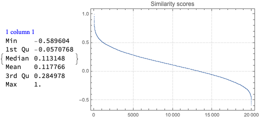
We do not examine the data source and we do not want to reason too much about the data using the stats. We started this notebook by just wanting to make the bubble charts (both 2D and 3D.) Nevertheless, we are tempted to say and justify statements like:
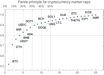
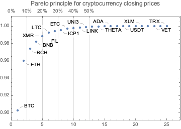
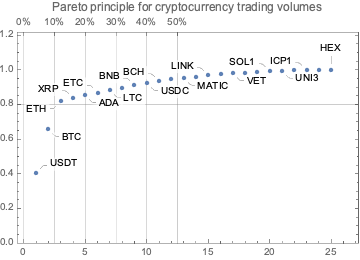
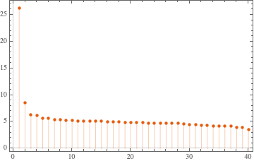
Here is the Pareto principle plot of for the number of created (or renamed) programming languages per creator (using the WFR function ParetoPrinciplePlot):
We can see that ≈25% of the creators correspond to ≈50% of the languages.
Popularity
Obviously, programmers can and do use more than one programming language. Nevertheless, it is interesting to see the Pareto principle plot for the languages “mind share” based on the number of users estimates.
Remark: Note that we “cheat” by adding 1 before taking the logarithms.
We obtain the tables of correlations plots using the newly introduced, experimental PairwiseListPlot. If we remove the rows with zeroes some of the correlations become more obvious. Here is the corresponding tab view of the two correlation tables:
Remark: In the 3D bubble chart plot “Mathematica” and “Wolfram Language” are easier to discern.
Second system effect traces
In this section we try — and fail — to demonstrate that the more programming languages a team of creators makes the less successful those languages are. (Maybe, because they are more cumbersome and suffer the Second system effect?)
Remark: This section is mostly made “for fun.” It is not true that each sets of languages per creators team is made of comparable languages. For example, complementary languages can be in the same set. (See, HTTP, HTML, URL.) Some sets are just made of the same language but with different names. (See, Perl 6 and Raku, and Mathematica and Wolfram Language.) Also, older languages would have the First mover advantage.
In this notebook we show information retrieval and clustering
techniques over images of Unicode collection of Chinese characters. Here
is the outline of notebook’s exposition:
Get Chinese character images.
Cluster “image vectors” and demonstrate that the obtained
clusters have certain explainability elements.
Apply Latent Semantic Analysis (LSA) workflow to the character
set.
Show visual thesaurus through a recommender system. (That uses
Cosine similarity.)
Discuss graph and hierarchical clustering using LSA matrix
factors.
Demonstrate approximation of “unseen” character images with an
image basis obtained through LSA over a small set of (simple)
images.
Redo character approximation with more “interpretable” image
basis.
In this section we cluster “image vectors” and demonstrate that the
obtained clusters have certain explainability elements. Expected Chinese
character radicals are observed using image multiplication.
Cluster the image vectors and show summary of the clusters
lengths:
Remark: We can see that the clustering above
produced “semantic” clusters – most of the multiplied images show
meaningful Chinese characters radicals and their “expected
positions.”
Here is one of the clusters with the radical “mouth”:
KeyTake[aCImages, lsClusters[[26]]]
131vpq9dabrjo
LSAMon application
In this section we apply the “standard” LSA workflow, [AA1, AA4].
Make a matrix with named rows and columns from the image vectors:
mat = ToSSparseMatrix[SparseArray[Values@aCImageVecs],"RowNames"-> Keys[aCImageVecs],"ColumnNames"->Automatic]
0jdmyfb9rsobz
The following Latent Semantic Analysis (LSA) monadic pipeline is used
in [AA2, AA2]:
I experimented with clustering and approximation using WL’s function FeatureExtraction.
Result are fairly similar as the above; timings a different (a few times
slower.)
Visual thesaurus
In this section we use Cosine similarity to find visual nearest
neighbors of Chinese character images.
Remark: By careful observation of the clusters and
graph connections we can convince ourselves that the similarities are
based on pictorial sub-elements (i.e. radicals) of the characters.
Hierarchical clustering
In this section we apply hierarchical clustering to the reduced
dimension representation of the Chinese character images.
Here is a heat-map plot with hierarchical clustering dendrogram (with
tool-tips):
gr = HeatmapPlot[W2[[lsFocusIDs,All]],DistanceFunction->{CosineDistance,None}, Dendrogram ->{True,False}];gr /.Map[# ->Tooltip[Style[#,FontSize->16],Style[#,Bold,FontSize->36]] &, lsFocusIDs]
0vz82un57054q
Remark: The plot above has tooltips with larger
character images.
Representing
all characters with smaller set of basic ones
In this section we demonstrate that a relatively small set of simpler
Chinese character images can be used to represent (or approxumate) the
rest of the images.
Remark: We use the following heuristic: the simpler
Chinese characters have the smallest amount of white pixels.
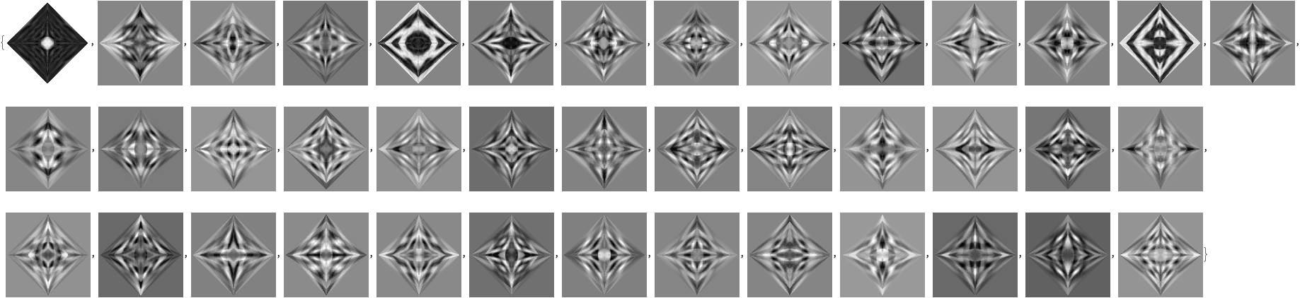
Obtain a training set of images – that are the darkest – and show a
sample of that set :
Remark: By applying the approximation procedure to
all characters in testing set we can convince ourselves that small,
training set provides good retrieval. (Not done here.)
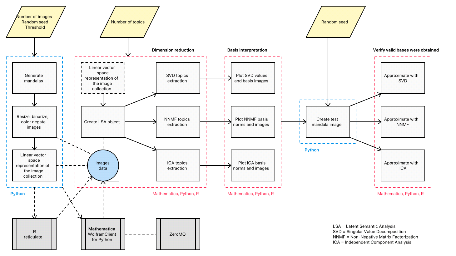
In this presentation we discuss the application of different dimension reduction algorithms over collections of random mandalas. We discuss and compare the derived image bases and show how those bases explain the underlying collection structure. The presented techniques and insights (1) are applicable to any collection of images, and (2) can be included in larger, more complicated machine learning workflows. The former is demonstrated with a handwritten digits recognition
application; the latter with the generation of random Bethlehem stars. The (parallel) walk-through of the core demonstration is in all three programming languages: Mathematica, Python, and R.
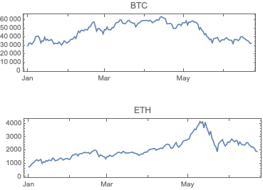
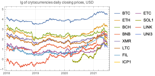
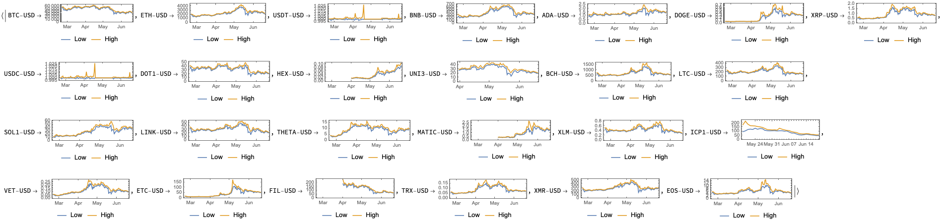
The main goal of this notebook is to provide some basic views and insights into the landscape of cryptocurrencies. The “landscape” we consider consists of price action and trading volume time series for cryptocurrencies found in Yahoo Finance.
Here is the work plan followed in this notebook:
Get cryptocurrency data
Do basic data analysis over suitable date ranges
Gather important cryptocurrency events
Plot together cryptocurrency prices and trading volume time series together with the events
Make observations and conjectures over the plots
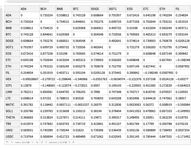
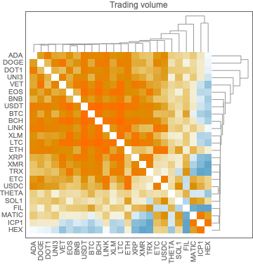
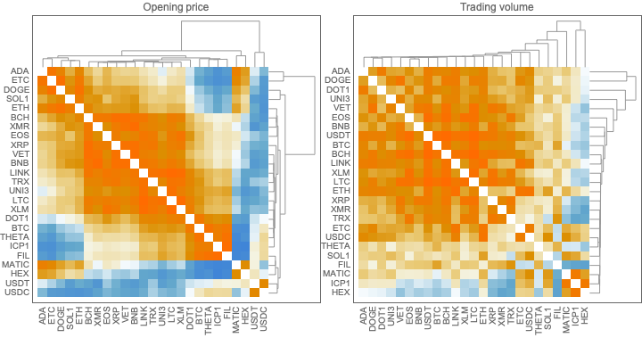
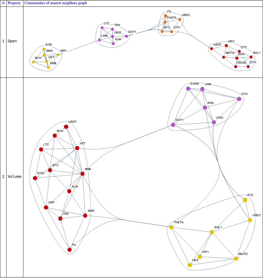
Find “global” correlations between the different cryptocurrencies
Find clusters of cryptocurrencies based on time series correlations
Here are some details for the steps above:
The procedure of obtaining the cryptocurrencies data, point 1, is explained in detail in [AA1].
There is a dedicated resource object CrypocurrencyData that provides cryptocurrency data and related documentation.
The cryptocurrency events data, point 3, is taken from different news sites.
Links are provided in the corresponding dataset.
The points 6 and 7 follow similar explorations (and code) described in [AA2, AA3].
Those two articles deal with COVID-19 time series.
Remark: Note that in this notebook we do not discuss philosophical, macro-economic, and environmental issues with cryptocurrencies. We only discuss financial time series data.
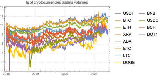
Cryptocurrencies data
The cryptocurrencies data used in this notebook is obtained from found in Yahoo Finance . The procedure of obtaining the cryptocurrencies data is explained in detail in [AA1]. There is a dedicated resource object CrypocurrencyData that provides the cryptocurrency data and related documentation.
Remark:FinancialData is “aware” of 10 cryptocurrencies, but that is not documented (as far as I can tell) and only prices are provided. (For more details see the discussion in CrypocurrencyData.) Here are examples:
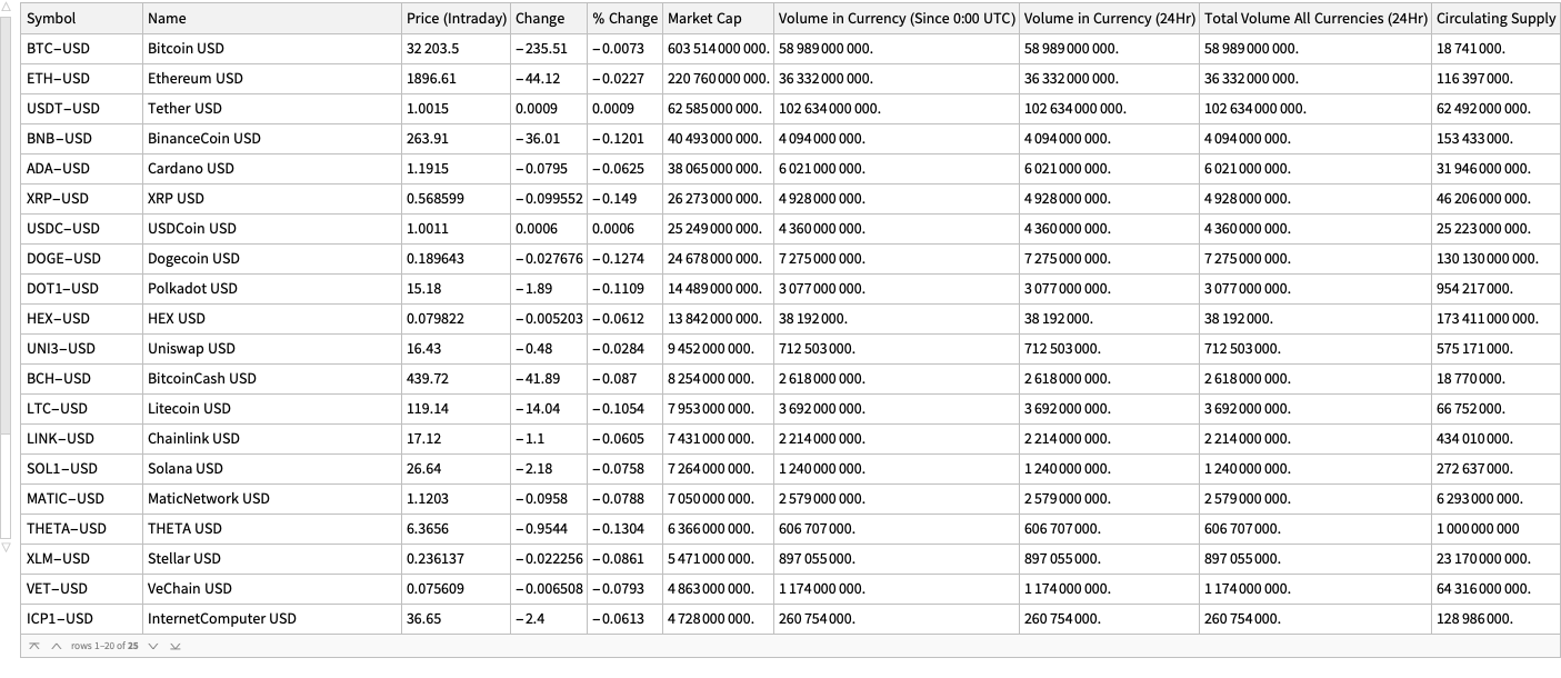
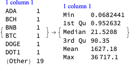
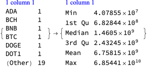
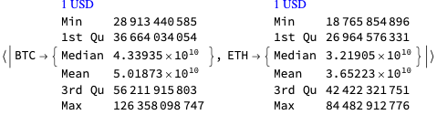
In this section we analyze the summaries of cryptocurrencies data in order to derive a list of the most significant ones.
We choose the phrase “significant cryptocurrency” to mean “a cryptocurrency with high market capitalization, price, or trading volume.”
Together with the summaries we look into the Pareto principle adherence of the corresponding values.
Remark: The Pareto principle adherence should be interpreted carefully here – the cryptocurrencies are not mutually exclusive when in comes to money invested and trading volumes. Nevertheless, we can interpret the corresponding value ratios as indicators of “mind share” or “significance.”
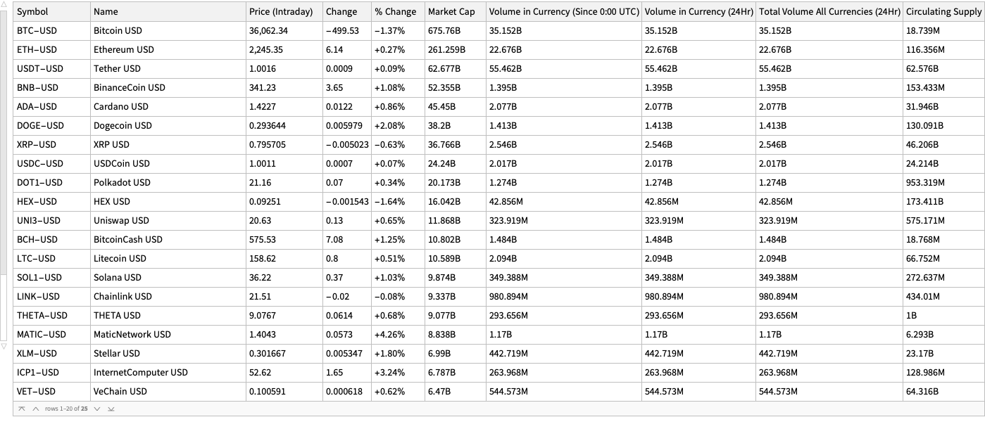
By summaries
Here is a summary of the cryptocurrencies we consider (from Yahoo Finance) ordered by “Market Cap” (largest first):
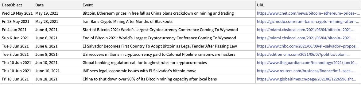
In this section we make a dataset that has the dates of certain cryptocurrency related events and links to their news announcements.
The events were taken by observing cryptocurrency board stories in the news aggregation site slashdot.org.
lsEventData ={{"Jun 18, 2021","China to shut down over 90% of its Bitcoin mining capacity after local bans","https://www.globaltimes.cn/page/202106/1226598.shtml"},{"Jun 10, 2021","Global banking regulators call for toughest rules for cryptocurrencies","https://www.theguardian.com/technology/2021/jun/10/global-banking-regulators-cryptocurrencies-bitcoin"},{"June 10, 2021","IMF sees legal, economic issues with El Salvador's bitcoin move","https://www.reuters.com/business/finance/imf-sees-legal-economic-issues-with-el-salvador-bitcoin-move-2021-06-10/"},{"June 8, 2021","El Salvador Becomes First Country To Adopt Bitcoin as Legal Tender After Passing Law","https://www.cnbc.com/2021/06/09/el-salvador-proposes-law-to-make-bitcoin-legal-tender.html"},{"June 8, 2021","US recovers millions in cryptocurrency paid to Colonial Pipeline ransomware hackers","https://edition.cnn.com/2021/06/07/politics/colonial-pipeline-ransomware-recovered/"},{"June 4, 2021","Start of Bitcoin 2021: World\[CloseCurlyQuote]s Largest Cryptocurrency Conference Coming To Wynwood","https://miami.cbslocal.com/2021/06/04/bitcoin-2021-worlds-largest-cryptocurrency-conference-coming-to-wynwood/"},{"June 6, 2021","End of Bitcoin 2021: World\[CloseCurlyQuote]s Largest Cryptocurrency Conference Coming To Wynwood","https://miami.cbslocal.com/2021/06/04/bitcoin-2021-worlds-largest-cryptocurrency-conference-coming-to-wynwood/"},{"May 28, 2021","Iran Bans Crypto Mining After Months of Blackouts","https://gizmodo.com/iran-bans-crypto-mining-after-months-of-blackouts-1846991039"},{"May 19, 2021","Bitcoin, Ethereum prices in free fall as China plans crackdown on mining and trading","https://www.cnet.com/news/bitcoin-ethereum-prices-in-freefall-as-china-plans-crackdown-on-mining-and-trading/#ftag=CAD590a51e"}};dsEventData = Dataset[lsEventData][All, AssociationThread[{"Date","Event","URL"}, #] &];dsEventData = dsEventData[All,Join[Prepend[#,"DateObject"-> DateObject[#Date]], <|"URL"-> URL[#URL]|>] &];dsEventData = dsEventData[SortBy[#DateObject &]]
1qjdxqriy9jbj
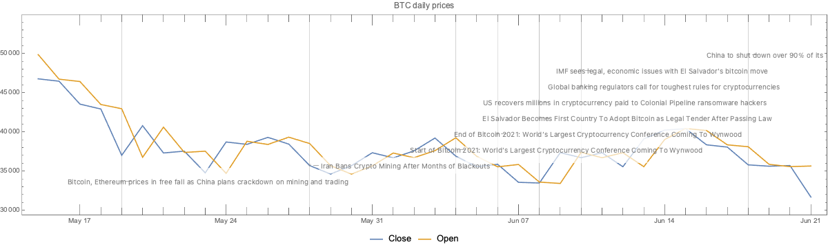
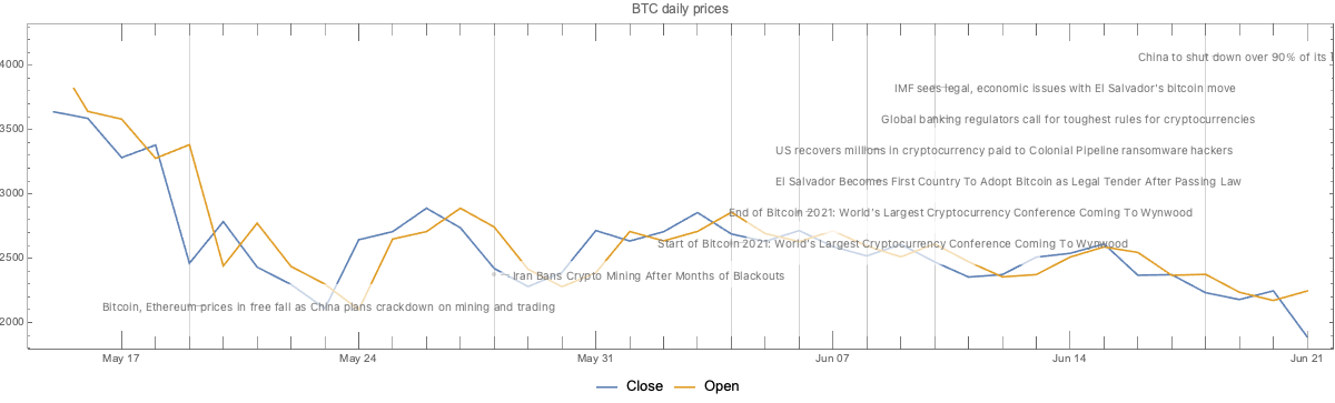
Cryptocurrency time series with events
In this section we discuss possible correlation and causation effects of reported cryptocurrency events.
Remark: The discussion is based on time series and events only, without considering other operational properties of the cryptocurrencies.
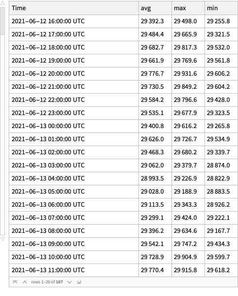
Here is a date range:
dateRange ={"May 15 2021","Jun 21 2021"};
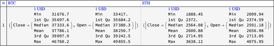
Here get time series for the daily opening and closing prices for the selected date range:
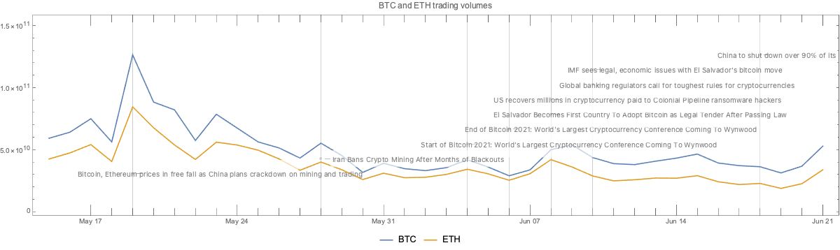
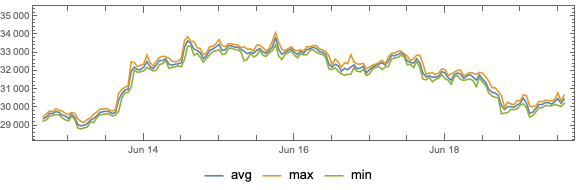
Here we plot the cryptocurrency events with together with the BTC trading volume time series:
CryptocurrencyPlot[{aCCVolume, dsEventData},PlotLabel->"BTC and ETH trading volumes",ImageSize->1200]
1ltpksb32ajim
Observations
Going down
We can see that opening prices and volume going down correlate with:
The news announcement that China plans to crackdown on mining and trading
The news announcement Iran bans crypto mining
The Sichuan Provincial Development and Reform Commission and the Sichuan Energy Bureau issue of a joint notice, ordering local electricity companies to “screen, clean up and terminate” mining operations
The start of the “Bitcoin 2021” conference
Related conjectures:
We can easily conjecture that 1 and 2 made cryptocurrencies (Bitcoin) less attractive to miners or traders in China and Iran, hence the price and the volume went down.
The most active Bitcoin traders were attending the “Bitcoin 2021” conference, hence the price and volume went down.
Going up
We can see the prices and volume going up correlate with:
The news announcement of El Salvador adopting BTC as legal tender currency
The news announcement that US Justice Department recovered most of the ransom paid to the Colonial Pipeline hackers
The end of the “Bitcoin 2021” conference
Related conjectures:
Of course, a country deciding to use BTC as legal tender would make (some) traders willing to invest in BTC.
The announcement that USA Justice Department, have made (some) traders to more confidently invest in BTC.
Although, the opposite could also happen – for some people if BTC can be recovered by law enforcement, then BTC is less attractive for financial transactions.
After the end of “Bitcoin 2021” conference the attending traders resumed their usual activity.
That conjecture and the “start of Bitcoin 2021” conjecture above support each other.
The same pattern is observed for both BTC and ETH trading volumes.
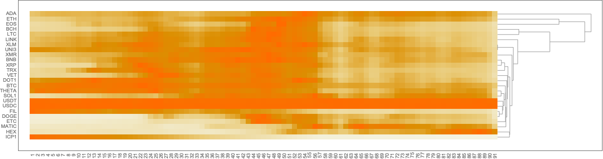
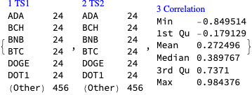
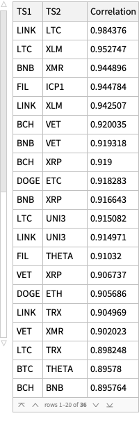
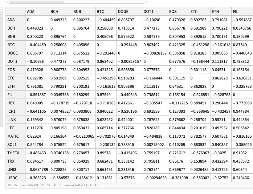
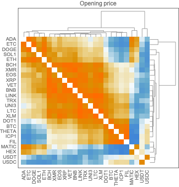
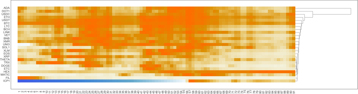
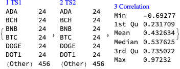
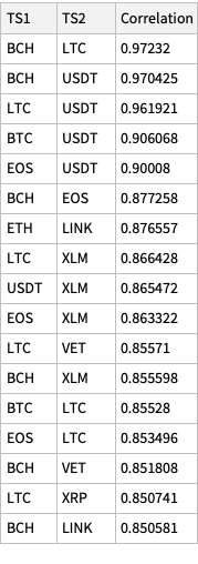
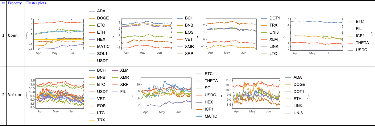
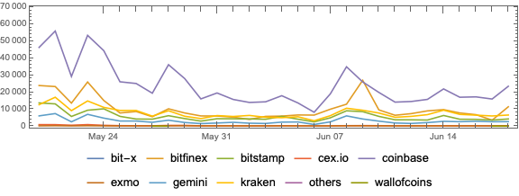
Time series correlations
In this section we compute and visualize correlations between the time series of a set of cryptocurrencies.
I investigated the data with several other methods:
Clustering with different methods and distance functions
Clustering after the application of Independent Component Analysis (ICA), [AAw5]
Time series analysis with Quantile Regression (QR), [AAw6]
None of the outcomes provided some “immediate”, notable insight. The analyses with ICA and QR, though, seem to provide some interesting and fruitful future explorations.
In this notebook we show how to obtain crypto-currencies data from several data sources and make some basic time series visualizations. We assume the described data acquisition workflow is useful for doing more detailed (exploratory) analysis.
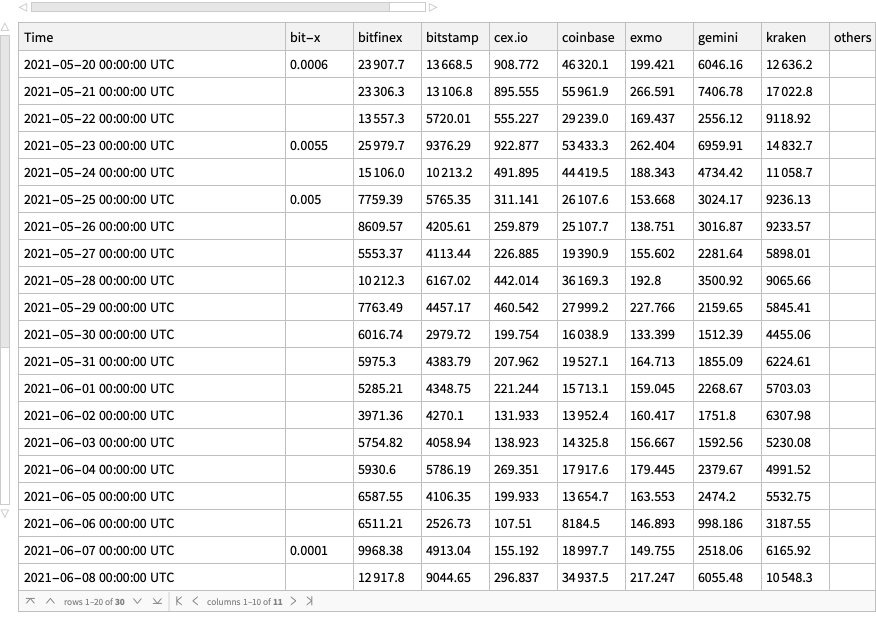
There are multiple crypto-currencies data sources, but a small proportion of them give a convenient way of extracting crypto-currencies data automatically. I found the easiest to work with to be https://finance.yahoo.com/cryptocurrencies, [YF1]. Another easy to work with Bitcoin-only data source is https://data.bitcoinity.org , [DBO1].
Remark: The code below is made with certain ad-hoc inductive reasoning that brought meaningful results. This means the code has to be changed if the underlying data organization in [YF1, DBO1] is changed.
Yahoo! Finance
Getting cryptocurrencies symbols and summaries
In this section we get all crypto-currencies symbols and related metadata.
Remark: Note that in the code above we specified the upper limit of the time span to be the current date. (And shifted it with respect to the epoch start 1970-01-01 used by [YF1].)
Remark: The metadata assigned above is used to form valid queries for the query string template.
Remark: Not all combinations of parameters are “fully respected” by data.bitcoinity.org. For example, if a data request is with time granularity that is too fine over a large time span, then the returned data is with coarser granularity.
Price for a particular currency and exchange pair
Here we retrieve data by overwriting the parameters for currency, time unit, time span, and exchange:
In this article we proclaim the preparation and availability of interactive interfaces to two Time Series Search Engines (TSSEs) over COVID-19 data. One TSSE is based on Apple Mobility Trends data, [APPL1]; the other on The New York Times COVID-19 data, [NYT1].
Here are links to interactive interfaces of the TSSEs hosted (and publicly available) at shinyapps.io by RStudio:
Motivation: The primary motivation for making the TSSEs and their interactive interfaces is to use them as exploratory tools. Combined with relevant data analysis (e.g. [AA1, AA2]) the TSSEs should help to form better intuition and feel of the spread of COVID-19 and related data aggregation, public reactions, and government polices.
The rest of the article is structured as follows:
Brief descriptions the overall process, the data
Brief descriptions the search engines structure and implementation
Discussions of a few search examples and their (possible) interpretations
The overall process
For both search engines the overall process has the same steps:
Ingest the data
Do basic (and advanced) data analysis
Make (and publish) reports detailing the data ingestion and transformation steps
Enhance the data with transformed versions of it or with additional related data
Make a Time Series Sparse Matrix Recommender (TSSMR)
Make a Time Series Search Engine Interactive Interface (TSSEII)
Make the interactive interface easily accessible over the World Wide Web
Here is a flow chart that corresponds to the steps listed above:
Data
The Apple data
The Apple Mobility Trends data is taken from Apple’s site, see [APPL1]. The data ingestion, basic data analysis, time series seasonality demonstration, (graph) clusterings are given in [AA1]. (Here is a link to the corresponding R-notebook .)
(It was too much work to get the weather data using some of the well known weather data R packages.)
The New York Times data
The New York Times COVID-19 data is taken from GitHub, see [NYT1]. The data ingestion, basic data analysis, and visualizations are given in [AA2]. (Here is a link to the corresponding R-notebook .)
The search engines
The following sub-sections have screenshots of the TSSE interactive interfaces.
I did experiment with combining the data of the two engines, but did not turn out to be particularly useful. It seems that is more interesting and useful to enhance the Apple data engine with temperature data, and to enhance The New Your Times engine with the (consecutive) differences of the time series.
Structure
The interactive interfaces have three panels:
Nearest Neighbors
Gives the time series nearest neighbors for the time series of selected entity.
Has interactive controls for entity selection and filtering.
Trend Finding
Gives the time series that adhere to a specified named trend.
Has interactive controls for trend curves selection and entity filtering.
Notes
Gives references and data objects summary.
Implementation
Both TSSEs are implemented using the R packages “SparseMatrixRecommender”, [AAp1], and “SparseMatrixRecommenderInterfaces”, [AAp2].
The package “SparseMatrixRecommender” provides functions to create and use Sparse Matrix Recommender (SMR) objects. Both TSSEs use underlying SMR objects.
The Apple data TSSE has four types of time series (“entities”). The first three are normalized volumes of Apple maps requests while driving, transit transport use, and walking. (See [AA1] for more details.) The fourth is daily mean temperature at different geo-locations.
Here are screenshots of the panels “Nearest Neighbors” and “Trend Finding” (at interface launch):
The New York Times TSSE has four types of time series (aggregated) cases and deaths, and their corresponding time series differences.
Here are screenshots of the panels “Nearest Neighbors” and “Trend Finding” (at interface launch):
Examples
In this section we discuss in some detail several examples of using each of the TSSEs.
Apple data search engine examples
Here are a few observations from [AA1]:
The COVID-19 lockdowns are clearly reflected in the time series.
The time series from the Apple Mobility Trends data shows strong weekly seasonality. Roughly speaking, people go to places they are not familiar with on Fridays and Saturdays. Other work week days people are more familiar with their trips. Since much lesser number of requests are made on Sundays, we can conjecture that many people stay at home or visit very familiar locations.
Here are a few assumptions:
Where people frequently go (work, school, groceries shopping, etc.) they do not need directions that much.
People request directions when they have more free time and will for “leisure trips.”
During vacations people are more likely to be in places they are less familiar with.
People are more likely to take leisure trips when the weather is good. (Warm, not raining, etc.)
Nice, France vs Florida, USA
Consider the results of the Nearest Neighbors panel for Nice, France.
Since French tend to go on vacation in July and August ([SS1, INSEE1]) we can see that driving, transit, and walking in Nice have pronounced peaks during that time:
Of course, we also observe the lockdown period in that geographical area.
Compare those time series with the time series from driving in Florida, USA:
We can see that people in Florida, USA have driving patterns unrelated to the typical weather seasons and vacation periods.
(Further TSSE queries show that there is a negative correlation with the temperature in south Florida and the volumes of Apple Maps directions requests.)
Italy and Balkan countries driving
We can see that according to the data people who have access to both iPhones and cars in Italy and the Balkan countries Bulgaria, Greece, and Romania have similar directions requests patterns:
(The similarities can be explained with at least a few “obvious” facts, but we are going to restrain ourselves.)
The New York Times data search engine examples
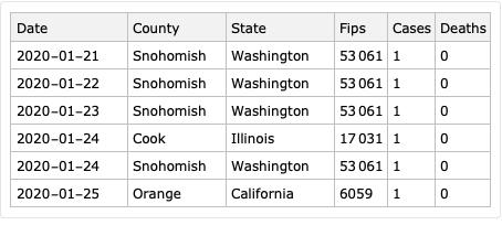
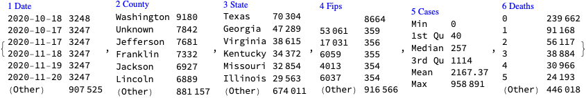
In Broward county, Florida, USA and Cook county, Illinois, USA we can see two waves of infections in the difference time series:
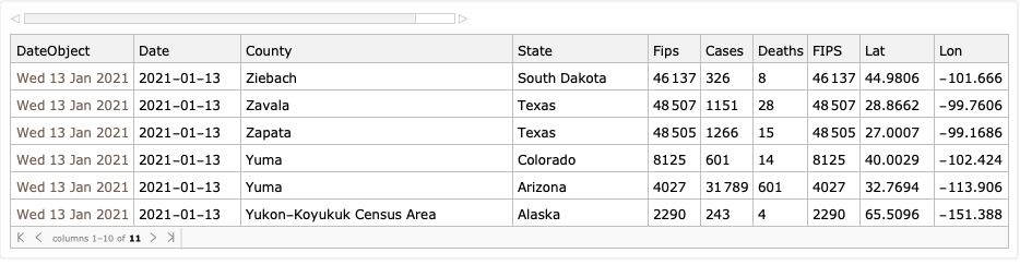
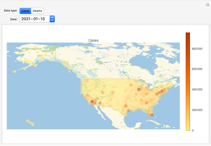
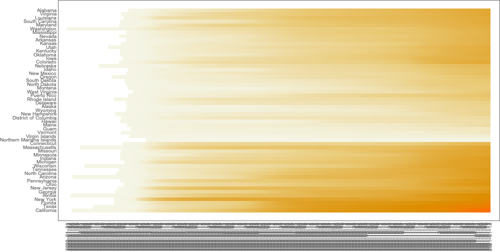
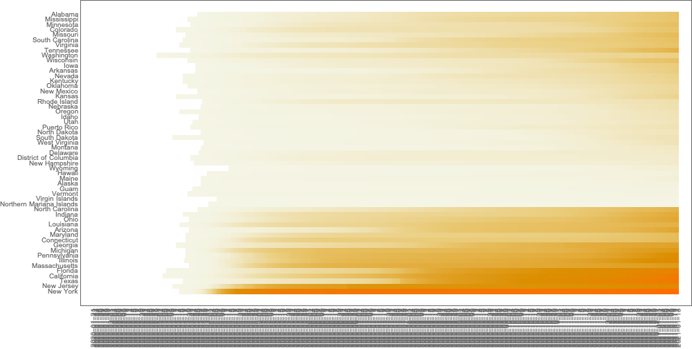
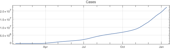
This post is both an update and a full-blown version of an older post — “NY Times COVID-19 data visualization” — using NY Times COVID-19 data up to 2021-01-13.
The purpose of this document/notebook is to give data locations, data ingestion code, and code for rudimentary analysis and visualization of COVID-19 data provided by New York Times, [NYT1].
The following steps are taken:
Ingest data
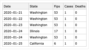
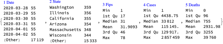
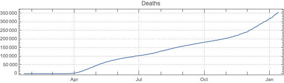
Take COVID-19 data from The New York Times, based on reports from state and local health agencies, [NYT1].
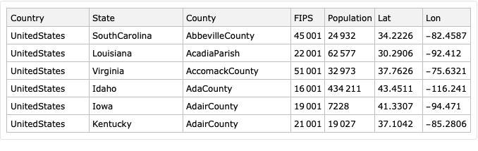
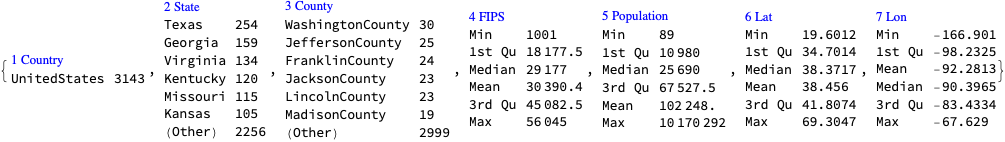
Take USA counties records data (FIPS codes, geo-coordinates, populations), [WRI1].
Merge the data.
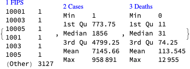
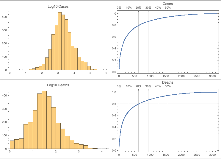
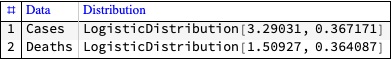
Make data summaries and related plots.
Make corresponding geo-plots.
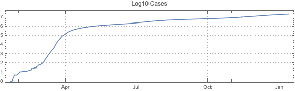
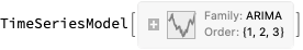
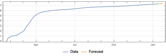
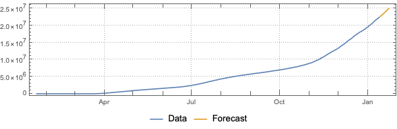
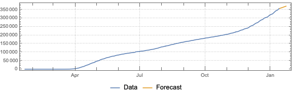
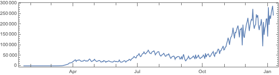
Do “out of the box” time series forecast.
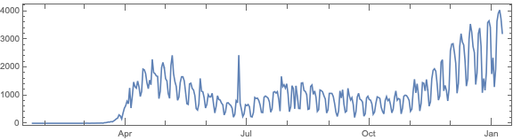
Analyze fluctuations around time series trends.
Note that other, older repositories with COVID-19 data exist, like, [JH1, VK1].
Remark: The time series section is done for illustration purposes only. The forecasts there should not be taken seriously.
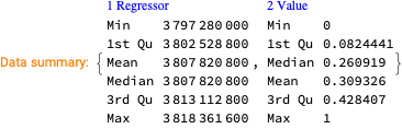
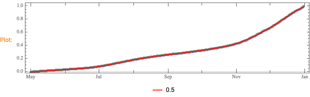
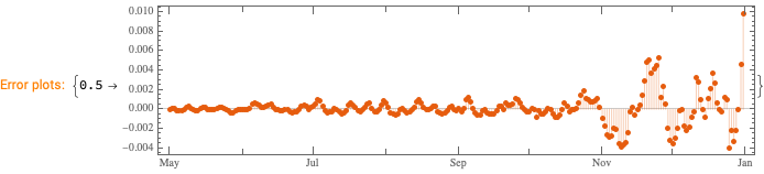
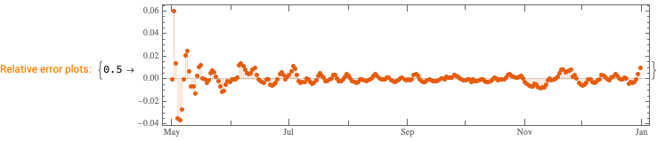
We want to see does the time series data have fluctuations around its trends and estimate the distributions of those fluctuations. (Knowing those distributions some further studies can be done.)
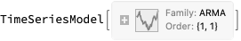
This can be efficiently using the software monad QRMon, [AAp2, AA1]. Here we load the QRMon package:
Here we specify QRMon workflow that rescales the data, fits a B-spline curve to get the trend, and finds the absolute and relative errors (residuals, fluctuations) around that trend:
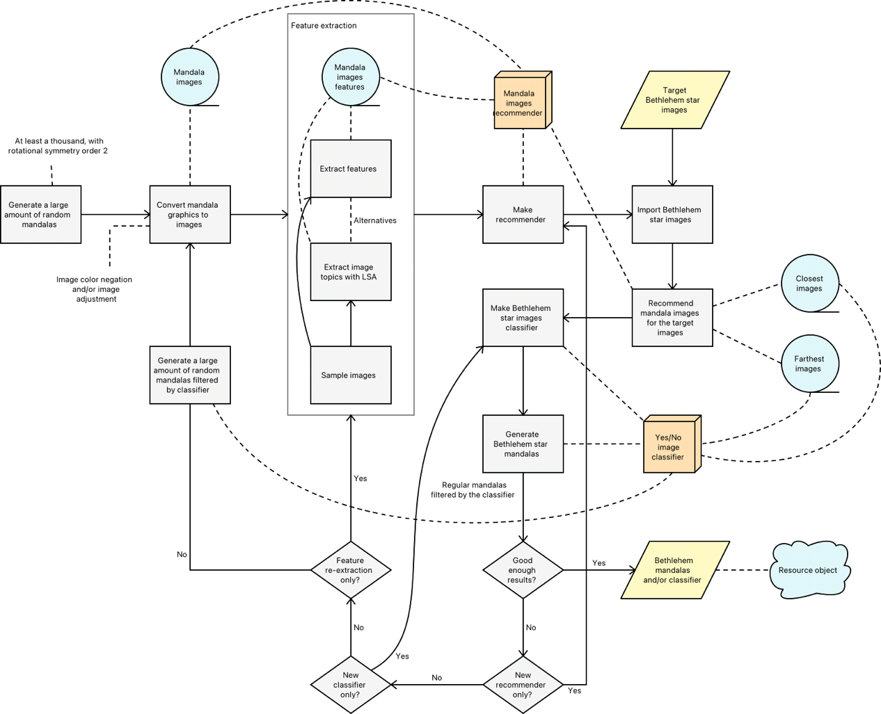
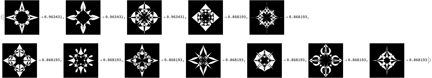
This document/notebook is inspired by the Mathematica Stack Exchange (MSE) question “Plotting the Star of Bethlehem”, [MSE1]. That MSE question requests efficient and fast plotting of a certain mathematical function that (maybe) looks like the Star of Bethlehem, [Wk1]. Instead of doing what the author of the questions suggests, I decided to use a generative art program and workflows from three of most important Machine Learning (ML) sub-cultures: Latent Semantic Analysis, Recommendations, and Classification.
Although we discuss making of Bethlehem Star-like images, the ML workflows and corresponding code presented in this document/notebook have general applicability – in many situations we have to make classifiers based on data that has to be “feature engineered” through pipeline of several types of ML transformative workflows and that feature engineering requires multiple iterations of re-examinations and tuning in order to achieve the set goals.
The document/notebook is structured as follows:
Target Bethlehem Star images
Simplistic approach
Elaborated approach outline
Sections that follow through elaborated approach outline:
Remark: The plot above looks prettier in notebook converted with the resource function DarkMode.
Elaborated approach
Assume that we want to automate the simplistic approach described in the previous section.
One way to automate is to create a Machine Learning (ML) classifier that is capable of discerning which RandomMandala objects look like Bethlehem Star target images and which do not. With such a classifier we can write a function BethlehemMandala that applies the classifier on multiple results from RandomMandala and returns those mandalas that the classifier says are good.
Here are the steps of building the proposed classifier:
Generate a large enough Random Mandala Images Set (RMIS)
Create a feature extractor from a subset of RMIS
Assign features to all of RMIS
Make a recommender with the RMIS features and other image data (like pixel values)
Apply the RMIS recommender over the target Bethlehem Star images and determine and examine image sets that are:
the best recommendations
the worse recommendations
With the best and worse recommendations sets compose training data for classifier making
Train a classifier
Examine classifier application to (filtering of) random mandala images (both in RMIS and not in RMIS)
If the results are not satisfactory redo some or all of the steps above
Remark: If the results are not satisfactory we should consider using the obtained classifier at the data generation phase. (This is not done in this document/notebook.)
Remark: The elaborated approach outline and flow chart have general applicability, not just for generation of random images of a certain type.
Flow chart
Here is a flow chart that corresponds to the outline above:
A few observations for the flow chart follow:
The flow chart has a feature extraction block that shows that the feature extraction can be done in several ways.
The application of LSA is a type of feature extraction which this document/notebook uses.
If the results are not good enough the flow chart shows that the classifier can be used at the data generation phase.
If the results are not good enough there are several alternatives to redo or tune the ML algorithms.
Changing or tuning the recommender implies training a new classifier.
Changing or tuning the feature extraction implies making a new recommender and a new classifier.
Data generation and preparation
In this section we generate random mandala graphics, transform them into images and corresponding vectors. Those image-vectors can be used to apply dimension reduction algorithms. (Other feature extraction algorithms can be applied over the images.)
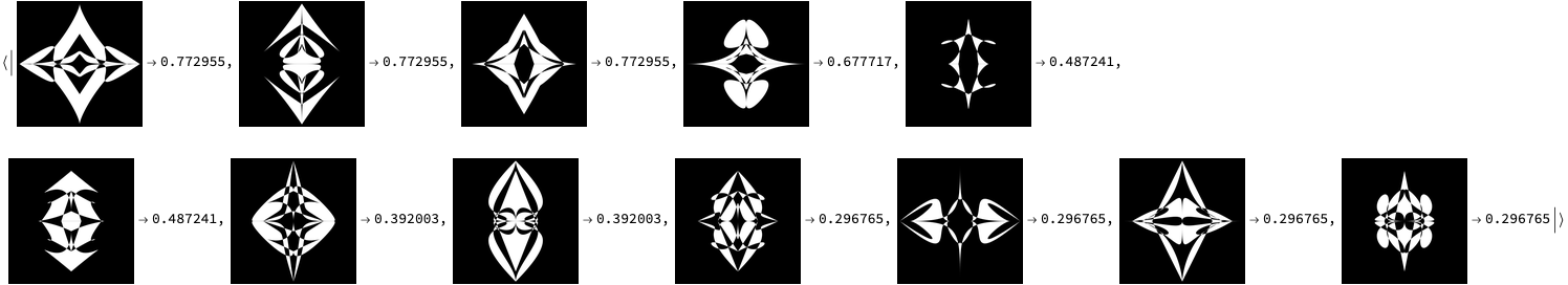
Remark: Note the weights assigned to the pixels and the topics in the recommender object above. Those weights were derived by examining the recommendations results shown below.
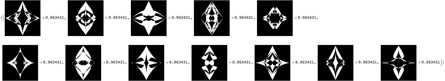
Here is the image we want to find most similar mandala images to – the target image:
Remark: Note that although a higher rotational symmetry order is used the highly scored results still seem relevant – they have the features of the target Bethlehem Star images.
(Note that mind-map’s PDF has hyperlinks. Also, see the folder Presentation-aids. )
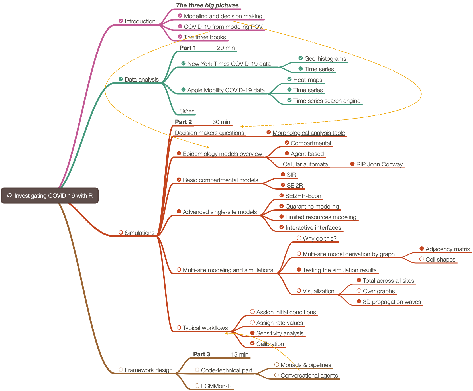
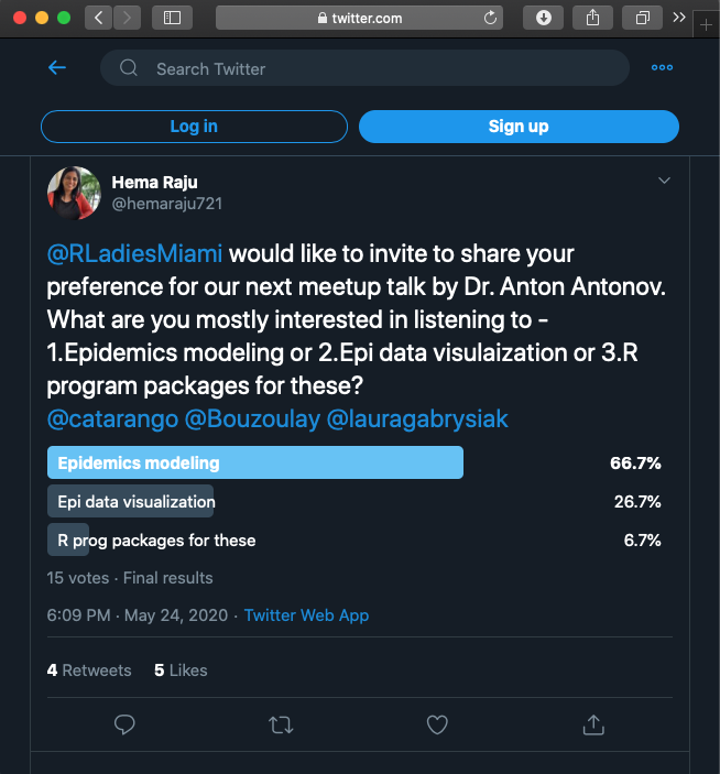
The organizers and I did a poll for what people want to hear. After discussing the results of the 15 votes from that poll we decided the presentation to be a methodological one instead of a know-how one.
Approximately 30% of the presentation was based on the R-project “COVID-19-modeling-in-R”, [AA1].
Approximately 30% of the presentation was based on an R-programmed software monad for epidemiology compartmental models, ECMMon-R, [AAr2].
For the rest were used frameworks, simulations, and graphics made with Mathematica, [AAr1].
The presentation was given online (because of COVID-19) using Zoom. 90 people registered. Nearly 40 showed up (and maybe 20 stayed throughout.)


